Discover the most common UX mistakes in banking apps and learn how user research, usability testing, and behavioral insights help improve digital banking experiences.

Tag
Research
Date
Read Time
4 Minutes
Content
Entropik Team
Consumers expect banking apps to be as intuitive as the digital products they use every day.
Checking balances, transferring money, paying bills, or managing cards should feel effortless. Yet many banking apps still introduce friction at critical moments, creating frustration when customers need simplicity most.
A confusing onboarding journey, difficult navigation, or a poorly designed transaction flow can quickly impact engagement, satisfaction, and trust.
The challenge is that many of these issues are invisible to product teams until real users encounter them.
This is why UX research plays such an important role in modern banking. It helps teams move beyond assumptions and design experiences around actual user behavior.
Why Banking App UX Matters
Unlike many digital products, banking apps sit at the intersection of convenience and trust.
Customers expect secure experiences, but they also expect speed and simplicity. When everyday tasks become difficult, frustration builds quickly.
The consequences can be significant:
Abandoned onboarding journeys
Lower feature adoption
Increased support costs
Poor app ratings
Reduced customer loyalty
In an increasingly competitive market, user experience has become a key driver of retention and growth.
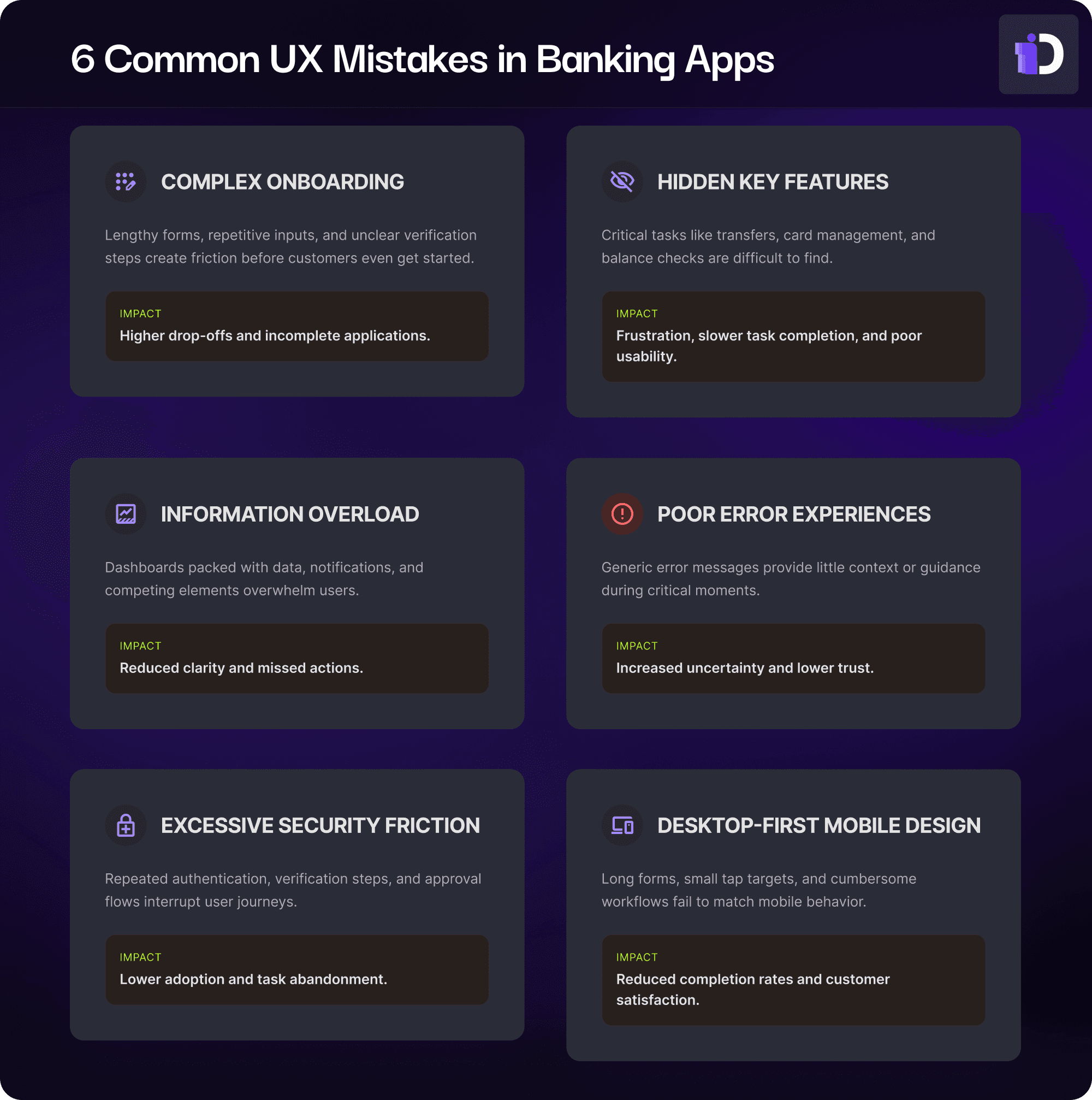
UX Mistake #1: Making Onboarding Feel Like Paperwork
Many banking apps treat onboarding as a compliance exercise rather than a customer experience.
Lengthy forms, repeated information requests, and unclear identity verification steps often create unnecessary drop-off points.
The strongest onboarding experiences simplify complex requirements into manageable steps, provide clear progress indicators, and reduce uncertainty throughout the journey.
Journey mapping, usability testing, and customer interviews often reveal where applicants become confused, hesitate, or abandon the process altogether.
UX Mistake #2: Hiding Important Features
Customers open banking apps with specific goals in mind.
They want to transfer funds, check balances, manage cards, or review transactions. When these actions are difficult to locate, even simple tasks become frustrating.
Poor navigation structures often emerge because product teams understand the system better than customers do.
Navigation testing, click tracking, and task-based studies help uncover whether users can find critical functions quickly and confidently.
UX Mistake #3: Overloading the Dashboard
Financial products generate a large amount of information, but more information does not automatically create a better experience.
Many banking apps overwhelm users with:
Dense account summaries
Excessive notifications
Complex financial terminology
Competing visual elements
The result is increased cognitive effort and reduced clarity.
Attention analysis and eye tracking often reveal a surprising reality: users ignore large portions of the information designers believe is important. Effective dashboards prioritize what matters most and make key actions immediately visible.
UX Mistake #4: Treating Errors as an Afterthought
Transaction failures, login issues, and payment interruptions are inevitable.
What separates great banking experiences from frustrating ones is how these moments are handled.
Generic error messages such as "Something went wrong" create uncertainty, especially when money is involved.
Users need reassurance, context, and clear next steps.
Observing customers during high-stakes scenarios often uncovers anxiety points that traditional analytics alone cannot explain.
UX Mistake #5: Adding Too Much Security Friction
Security is fundamental to digital banking.
However, security measures that repeatedly interrupt users can become barriers to adoption.
Examples include:
Excessive authentication requests
Complicated password requirements
Repetitive verification steps
Multi-stage approval flows
The goal is not reducing security. The goal is creating experiences where security feels seamless rather than burdensome.
The most effective banking products balance compliance requirements with usability expectations.
UX Mistake #6: Designing for Desktop Behaviors
Mobile devices have become the primary banking channel for many consumers.
Yet some banking experiences still feel like desktop workflows squeezed onto smaller screens.
Common signs include:
Small tap targets
Long forms
Excessive scrolling
Multi-step processes that feel cumbersome on mobile devices
Mobile usability studies frequently reveal friction points that are difficult to identify through internal reviews alone.
Designing for real-world mobile behavior often leads to significant improvements in task completion and customer satisfaction.
How Leading Banks Use Research to Reduce Friction
The most successful digital banking experiences are continuously shaped by customer feedback and behavioral insights.
Research methods such as:
User interviews
Usability testing
Journey mapping
Eye tracking
Click tracking
Behavioral analytics
help teams understand not just where problems exist, but why they occur.
As a Unified Human Insights Platform, Decode by Entropik brings together qualitative, quantitative, behavioral, and emotional insights in a single workflow. By combining interviews, usability testing, eye tracking, click tracking, and AI-powered analysis, product teams can identify friction points faster and make more confident experience decisions.
Building Better Banking Experiences
Great banking apps are not created through internal opinions or design assumptions.
They are built through a continuous understanding of how customers think, navigate, decide, and interact.
The organizations that invest in UX research gain a significant advantage: they identify friction before it impacts customers.
In digital banking, even small improvements can have an outsized effect on trust, engagement, and long-term loyalty.
Frequently Asked Questions
Why is UX important for banking apps?
UX directly impacts customer satisfaction, engagement, trust, and retention. Even small usability issues can create friction during critical tasks such as onboarding, fund transfers, or bill payments, leading to frustration and abandonment.
What are the most common UX mistakes in banking apps?
Common issues include complicated onboarding flows, confusing navigation, information overload, poor error handling, excessive security friction, and mobile experiences that are not optimized for real-world usage.
How do banks use UX research?
Banks use user interviews, usability testing, journey mapping, eye tracking, click tracking, and behavioral analytics to understand customer needs, identify friction points, and improve digital experiences.
What is usability testing for banking apps?
Usability testing involves observing users as they complete common banking tasks within an app. It helps teams identify navigation issues, confusing workflows, and barriers that prevent successful task completion.
How can banks improve mobile banking experiences?
Banks can improve mobile banking experiences by simplifying navigation, streamlining onboarding, optimizing information hierarchy, reducing unnecessary friction, and continuously testing designs with real users.


