Senior Growth Marketer
Overall Score
84 / 100
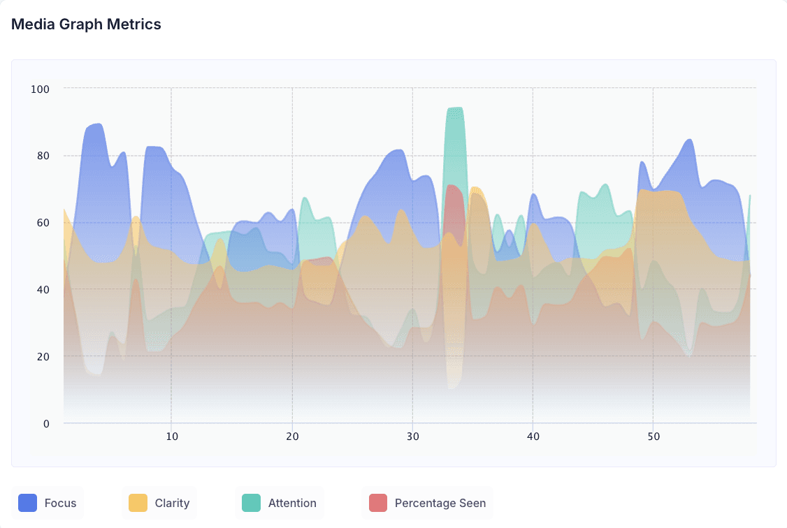
Highest Focus
89 at 0:04
This lands right as the camera widens from the extreme close-up on Trinity into the full ornate bedroom, with luxury and money motifs becoming visible for the first time. That's the moment the premise starts revealing itself — the viewer isn't just looking at a glamorous face anymore, they're trying to work out what world this is and why. Focus peaks here because the widen forces active interpretation rather than passive viewing. The mystery is doing the work, not the visuals alone.
Lowest Focus
10 at 0:33
This falls inside the fast transition back into the extravagant environment immediately after the Verizon Dollars product close-up (0:29.5–0:32). Notably, this is the exact same timestamp as the Highest Attention peak — which is the most useful data point in this breakdown. The cut is visually eventful enough to grab the eye, but it's a pure transition beat with no new information to process, so sustained cognitive focus drops even as attention spikes. This isn't a weakness so much as a structural cost of pacing: quick cuts buy visual energy at the expense of mental engagement, and the data shows that trade-off happening in real time.
Highest Clarity
70 at 0:35
This coincides with the close-up of the elaborate multi-tier cake. On its own, a cake isn't a message beat — but its simplicity matters. After a run of crowded, busy compositions (the dining scene, the reaction shot, the rapid transition), a single, clean object gives the viewer's processing a moment to catch up. Clarity likely isn't peaking because of what the cake means, but because of what it isn't: it's the easiest single image to parse in the entire mid-section, and it appears right when viewers most need a breather from visual density.
Lowest Clarity
48 at 0:37
This sits inside the outdoor crowd/procession sequence (0:35.7–0:39.1), which the breakdown itself describes as emphasizing "spectacle and abundance" — a deliberately dense, maximalist composition. Attention and emotional engagement can both hold up fine here; the issue is comprehension, not interest. This is the clearest example in the data of focus and clarity pulling apart: viewers can be locked into the scene while still not being entirely sure what specific idea it's communicating.
Highest Attention
93 at 0:33
As noted above, this is the fast cut back into the extravagant world right after the second product close-up. Attention spikes because a hard transition is one of the most reliable visual attention-grabbers there is — it resets visual novelty instantly. The ad uses the product beat, then immediately snaps back into spectacle, and that snap is what the eye responds to most strongly in the entire film.
Lowest Attention
22 at 0:28
This falls during the male character reaction/interaction shot at the dining scene (0:25.8–0:28.1). It's a secondary character, a smaller compositional moment, and a pause in the Trinity-centered visual rhythm the rest of the film establishes. The drop points to something specific: attention in this film is closely tied to Trinity's presence and the scale of the world around her. The one moment she's not the visual anchor is the one moment attention falls away.
Summary
Verizon turns a 3% cash-back rewards benefit into a royal fantasy, using Trinity Tatum as a literal “Queen of Cash” to make an otherwise unremarkable loyalty mechanic feel worth watching.
The insight underneath is simple: people like being rewarded for something they’re already paying for, but “cash back” as a phrase carries almost no emotional weight on its own. Rather than explain the percentage, the film dramatizes the feeling the percentage is supposed to produce — it stages an entire palace, a wardrobe of period-inspired costuming, attendants, gardens, a banquet, and a procession, all built around one woman being treated like royalty for no stated reason. That unexplained opulence is the hook: the first several seconds don’t look like a telecom ad at all, and the gap between “why is she being treated like this” and “oh, because she’s earning cash back” is what pulls the viewer through the middle of the film.
The product enters twice as a deliberate interruption — the Verizon Dollars balance shown early on the phone, then a clearer UI close-up mid-film — grounding the fantasy in an actual, real feature before returning to spectacle. That rhythm (fantasy → product proof → fantasy) is what lets the film sell an emotional idea without losing the functional one entirely. It resolves with the plainest copy in the whole 58 seconds — “Cash back every month,” “Verizon Dollars,” “Just for being a customer” — a direct payoff after nearly 50 seconds of indirection. What the audience is meant to walk away with isn’t a mechanic, it’s a feeling: being a Verizon customer should feel like more than paying a bill.
Emotional Insights
Positive: 78 | Happy: 68 | Surprise: 48 | Neutral: 26 | Negative: 8 | Sadness: 1.5 | Fear: 2.5 | Anger: 2 | Contempt: 1 | Disgust: 1
The emotional profile is almost entirely uncontested — negative-cluster emotions (sadness, disgust, contempt, anger, fear) all sit near zero, while positive and happy dominate. That’s consistent with the creative’s tone: this is a film about abundance and celebration, and there’s no moment of real tension, discomfort, or conflict built into the story for negative emotion to attach to. The one notable secondary reading is surprise at 48 — high enough to matter, and it fits the “why is she being treated like a queen” premise perfectly. Surprise here isn’t shock or discomfort, it’s curiosity-driven; it’s doing the job of pulling attention into the mystery rather than unsettling the viewer. The moderate neutral score (26) likely reflects the montage stretches — the fountain, cake, and floral cutaways — where the viewer is absorbing scale and detail rather than reacting emotionally moment to moment. Overall, the emotional data supports the creative idea directly: this is meant to feel good and slightly bewildering in a pleasant way, and the numbers back that up cleanly.
The Commercial
Heatmap Video
Fogmap Video
Suggestion for Improvement
1. Tighten the gap between spectacle and message clarity
Clarity (54) sits 20 points below benchmark (74) — the single largest gap of any metric in this dataset. The LC dip at 0:37 lands during the densest, most maximalist crowd sequence, which suggests the film may be asking viewers to hold too many competing visual elements at once without a clear read on what to focus on. A version of this film that inserts even one more clean, uncluttered beat mid-montage — similar to what the cake close-up does at the HC peak (0:35) — could give viewers more room to process the story before the final message lands.
2. Anchor the peak attention moment to the product, not just the edit
The Highest Attention moment (93 at 0:33) is a hard cut, not a narrative or product moment — and Attention overall sits 16 points below benchmark (46 vs. 62). That indicates the film may be relying on editing rhythm to hold the eye rather than on the content of the scenes themselves. Building a genuine attention peak around the second product reveal (0:29.5–0:32), rather than around the cut that follows it, would tie the film's strongest attention-grabbing device more directly to the commercial's actual selling proposition.
3. Address the LF/HA overlap at 0:33 directly
Lowest Focus and Highest Attention occur at the exact same timestamp. That's a meaningful signal: the moment most successfully grabbing the eye is also the moment least successfully holding the mind. It suggests the transition is fast enough to be noticed but too content-free to be processed. Slowing that specific cut by even half a second, or giving it a small narrative anchor (a reaction, a detail, a sound cue), could convert a pure attention spike into an attention-plus-focus moment.
Decode Takeaway
The Decode data tells a clear story of a film that wins on immersion before it wins on comprehension. Engagement (74) and Focus (60) both beat benchmark comfortably, proving the fantasy-first structure succeeds at what it's built to do: hold people inside an unexplained, glamorous world long enough to care about the reveal. But Clarity (54) and Attention (46) both trailing benchmark — with the widest gap on Clarity — point to a creative that leans harder on spectacle than on legibility at any given moment. The overlap between the Lowest Focus and Highest Attention scores at the same timestamp (0:33) is the single most telling data point here: this is an ad whose editing can grab the eye faster than the story can hold the mind. The strategy is working. The execution has room to let the message breathe a little more inside the spectacle
Creative agency: Verizon In-house Team