Senior Growth Marketer
Overall Score
76 / 100
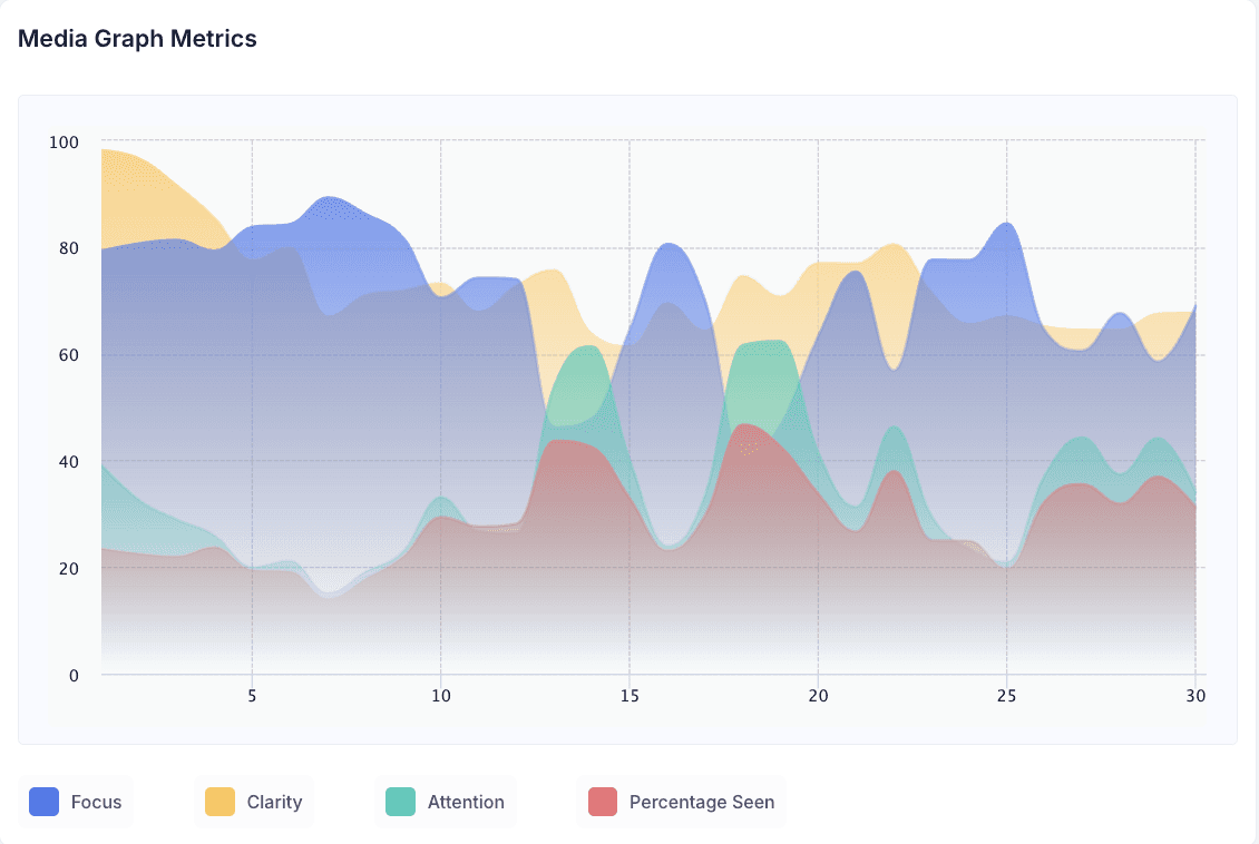
Highest Focus
89 at 0:07
This lands as the mother is first shown holding the baby, visibly tired. It is the moment the ad's real subject appears. Everything before it (the courier, the doorway, the walk inside) is table-setting. Once the tired mother is on screen, the viewer has something to track: a specific person under strain. Focus jumping to its peak here suggests the emotional hook isn't the delivery itself, it's her.
Lowest Focus
40 at 0:18
This falls as the woman leaves the bedroom carrying the baby, with tissues and clutter visible on the floor. It's a connective beat, not a payoff moment: it moves the story from one caregiving demand to the next without introducing anything new. A dip here isn't necessarily a flaw. Transitional shots that stitch together escalating vignettes often read as lower-focus by design, since there's no new information for the viewer to process.
Highest Clarity
80 at 0:22
This is where the man is shown relaxed on the couch under a blanket. Clarity peaking here makes sense: this is the moment the contrast at the center of the ad becomes legible. Up to this point the viewer has watched escalating strain. Here, the joke resolves into a comparison: she has the household, he has the remote. The mechanism of the ad, one person doing everything while the other is comfortable, only becomes fully readable once both halves of that contrast are visible on screen.
Lowest Clarity
61 at 0:15
This sits inside the bedroom scene, as the man is shown unwell and the woman checks his forehead. This is the point where the story adds its second demand on her (a sick partner, on top of the baby) and clarity dips slightly as the narrative reorients. It's worth separating from focus here: the viewer isn't disengaged, they're mentally re-calibrating what kind of situation this is. Clarity lags briefly while the story pivots; attention and focus don't necessarily follow it down.
Highest Attention
70 at 0:19
This is the close-up of the woman looking visibly worn out. It's the most classically "attention-grabbing" moment in the spot: a tight shot on a single expressive face, arriving right after the ad has stacked two caregiving burdens on her. Faces in close-up, especially at a visible emotional low point, are reliable attention magnets, and the data reflects that here.
Lowest Attention
15 at 0:07
Notably, this is the same timestamp as the Highest Focus score. At 0:07 the viewer is maximally focused (89) on the tired mother, but that moment isn't pulling the eye the way the close-up at 0:19 does. That combination is instructive: this scene is doing cognitive work, establishing who the ad is about, more than visual work. It's a useful reminder that Focus and Attention are measuring different things. The viewer can be mentally locked into the story while the frame itself stays visually unremarkable.
Summary
DoorDash turns a mother’s overloaded night into a one-line resolution: relief, delivered.
The ad doesn’t open with food or a product demo. It opens with a black screen and a claim of authenticity (“based on a DoorDash order far, far too real”), then spends most of its runtime stacking recognizable domestic pressures: a baby that needs attention, a sick partner who needs care, a visibly cluttered house. The insight underneath it is simple and specific: the exhaustion of carrying several caregiving demands at once is instantly recognizable to a huge share of viewers, and that recognition does more work than a joke would.
The story develops through accumulation rather than a single punchline. Each scene adds another task to her plate before the ad reveals the contrast that gives the accumulation its emotional charge: the man resting comfortably while she is still working. That contrast, not any single gag, is the creative engine of the spot.
The product enters late and quietly. DoorDash isn’t demonstrated, it’s implied through the courier at the door early on, then resolved at the very end through the phone on the table and the line “Mom relief. Delivered.” That phrasing does the strategic work the rest of the ad sets up: it reframes the product from a food-arrival service into something that removes one task from an already full night. What the audience is meant to remember isn’t a delivery feature, it’s the feeling of being handed relief exactly when there’s nothing left to give.
The data supports that read. Focus and Clarity are solid because the narrative logic tracks cleanly from setup to payoff. Attention is comparatively low because the ad rarely gives the eye anything novel to latch onto: warm domestic interiors, a tired face, a sick partner, a couch. The strategy is built on recognition, not visual surprise, and the Decode profile reflects exactly that trade-off.
Emotional Insights
Positive: 66 | Happy: 64 | Neutral: 42 | Surprise: 35 | Sadness: 22 | Negative: 28 | Fear: 14 | Anger: 18 | Contempt: 8 | Disgust: 7
Positive and happy dominate, which fits an ad that resolves into relief rather than staying in its own tension. The sadness (22) and negative (28) scores are not incidental noise, they’re the ad doing its job in the middle stretch, where the viewer is meant to feel the weight of what the mother is dealing with. The fact that the ad still closes with positive as the dominant emotion suggests that weight is functioning as setup, not as the ad’s actual mood.
The relatively high neutral score (42) is worth flagging. It suggests a meaningful share of the response is cognitive rather than emotional, viewers processing “yes, this is what that looks like” rather than being emotionally swept along. That tracks with a spot whose core mechanism is recognition of a familiar situation rather than an emotional swing or a big reveal.
Surprise at 35 is moderate rather than high, which is consistent with the ad’s structure: nothing here is designed to shock, the mild surprise more likely comes from the “far, far too real” framing device at the open than from anything in the story itself.
The Commercial
Heatmap Video
Fogmap Video
Suggestion for Improvement
Address the Attention gap without sacrificing realism. Attention (35) is meaningfully behind Focus (71) and Clarity (73), and the ad's visual language stays fairly uniform (warm domestic interiors, static coverage of a tired mother) for most of its runtime. A small visual disruption mid-way, a slightly more dynamic shot or a brief change in pacing around the 0:15 to 0:19 stretch, could lift attention without undermining the grounded, relatable tone the strategy depends on.
Bring the contrast forward slightly. Clarity peaks late, at 0:22, when the man on the couch finally gives the mother's exhaustion its point of comparison. Everything before that is setup without payoff. A brief, early visual hint of the contrast (even a fleeting shot of him relaxed, cut against her workload) could help viewers frame the accumulating scenes as they happen, rather than only making sense of them retroactively.
Reinforce brand presence earlier without giving away the payoff. The DoorDash bag and courier appear early, but the brand recedes almost entirely until the end card. Since the current data shows solid Focus and Clarity but softer Engagement (58), a subtle mid-film touchpoint, the bag visible in a background shot during the chaos, for instance, could keep the brand thread present without disrupting the delayed reveal.
Test whether the Lowest Clarity dip at 0:15 is a genuine comprehension issue. The bedroom pivot, adding the sick partner, causes a brief clarity dip as the story recalibrates. Since Focus stays reasonably high through this stretch, this likely isn't a real weakness, but if it recurs across future recuts of the ad, it may be worth a slightly clearer visual transition into that second demand.
Decode Takeaway
This ad works by making the viewer recognize a situation rather than by surprising them, and the data reflects that trade-off cleanly. Focus and Clarity are strong because the narrative logic is easy to follow start to finish, and the emotional profile resolves positively because the ad is built to end in relief, not to dwell in strain. The soft spot is Attention, the visual craft doesn't do much independent work to hold the eye, which suggests the creative is relying on the strength of its premise more than on its execution. For a brand whose core promise is relief from overload, that may be an acceptable trade, but it also means the ad has more headroom on the visual side than the story side.
Creative agency: DoorDash in-house creative team