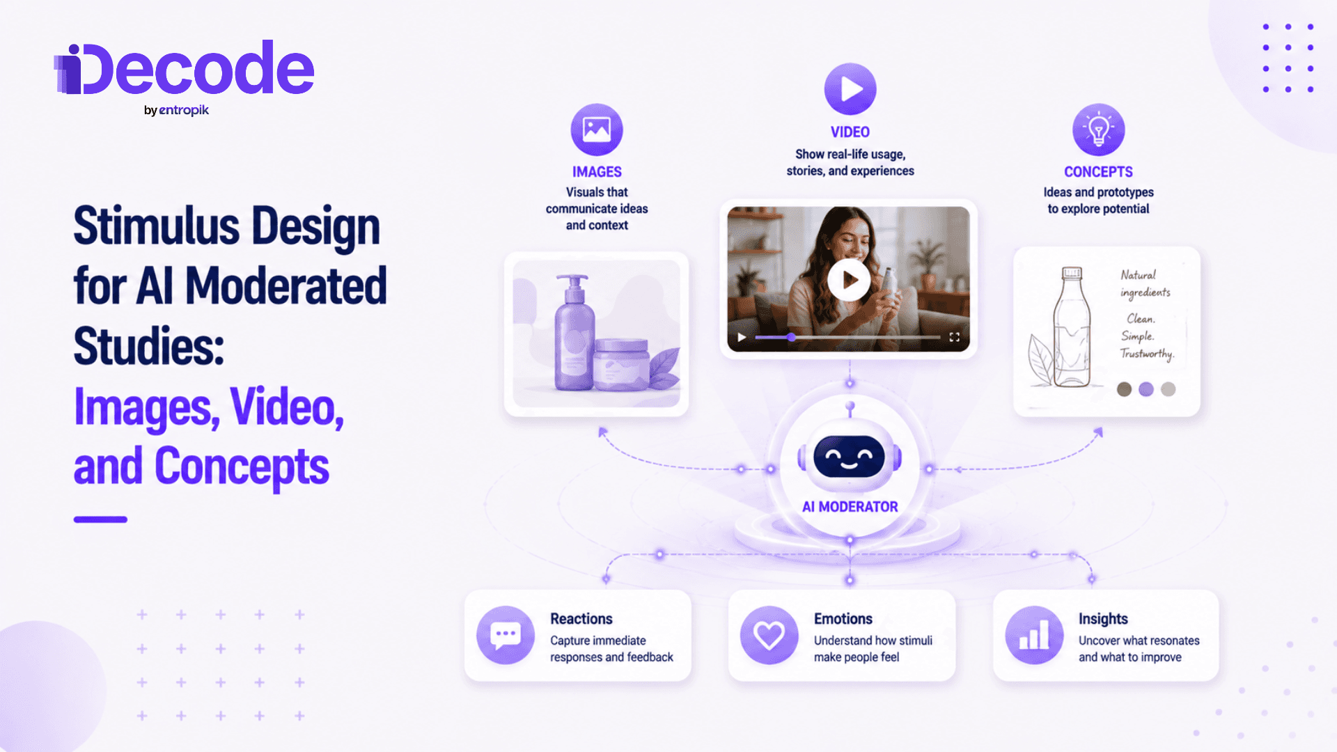
Stimulus design for AI moderated studies is the process of preparing and presenting visual materials, such as images, video, and concept boards, so participants give clean, comparable reactions during an automated interview. It covers stimulus type and fidelity, unbiased image preparation, written descriptions that guide the AI moderator, and sequencing that controls order effects and fatigue.
Summary:
|
What is stimulus design in AI moderated research?
Stimulus is the concrete material a participant reacts to during a study: a static image, a video, a concept board, or an interactive mockup. Stimulus design is the process of preparing and presenting that material so reactions are clean, comparable, and free of avoidable bias.
The one detail that makes this different in AI moderation is easy to miss: the AI moderator cannot see the stimulus. It works entirely from the researcher's written description, probing based on what that description tells it to look for. A qualitative research platform can only ask about what it's been told is there, which means stimulus quality and stimulus description quality both set the ceiling on how good the resulting AI moderated interviews turn out. Preparation matters as much as the questions you ask.
Why stimulus quality determines the reactions you get
A concept shown in isolation produces different reactions than the same concept shown in the context it will actually appear in. A package tested against a plain white background gets evaluated differently than the same package tested on a simulated shelf next to competitors. Neither context is wrong, but they answer different questions, and conflating them often leads to misleading results.
There's also a fidelity trap worth naming early: polished stimulus tends to draw feedback on execution (the colors, the copy, the layout), while rough stimulus draws feedback on the underlying idea. Neither is universally better. The research literature on this is more nuanced than most teams expect: an independent review of prototype fidelity studies found that most comparisons show low- and high-fidelity stimulus surfacing largely equivalent findings, with only a handful of studies favoring high fidelity outright. The right choice depends on what stage of research you're in, and using a mismatched fidelity level for the stage, whether for a usability study or a brand concept test, is one of the most common ways a study collects the wrong kind of feedback without anyone noticing until analysis.
This isn't a small factor in outcomes. Nielsen's analysis of nearly 500 ad campaigns found that creative quality drives roughly 47 to 49 percent of a campaign's sales lift, more than any other single factor, including targeting and media reach. If the creative itself is the biggest driver of real-world outcomes, then how faithfully a study's stimulus represents that creative directly affects how trustworthy the reactions to it are.
Designing stimulus by format: images, video, and concepts
Four formats cover most AI moderated studies, and each one has its own design considerations. What holds across all four is that AI moderation handles them consistently across every participant, the way a live moderator holding up a physical board or scrolling a phone screen never quite can. This consistency matters because creative effectiveness depends on comparing reactions fairly across participants, not on any one moderator's delivery.
Static images and visual stimuli
Keep resolution, aspect ratio, background, and framing consistent across any set participants will compare. A comparison where one image is sharper or better lit than another introduces a confound unrelated to the concept being tested.
Remove watermarks, draft labels, and any brand cues that could signal an internal preference and bias reactions before the participant has formed their own opinion. On file format: PNG holds up better for graphics with text or sharp edges, while JPEG or WebP is usually the better choice for photographs, where file size matters more than pixel-perfect edges.
Video and motion stimulus
Keep segments short, and tie probing questions to specific moments in the video rather than asking for general recall after the fact. A participant asked "what did you think of the video" gives a vaguer, less useful answer than one asked "what did you think when the product appeared at the 12-second mark." This mirrors how ad testing breaks a spot down moment by moment rather than asking for one overall verdict.
Test comprehension before appeal. If a participant didn't understand what the video was showing, their opinion doesn't measure what the study needs. Once you confirm comprehension, move to appeal and intent. And make sure playback loads reliably: a stalled video mid-interview doesn't just waste time, it can color a participant's reaction to everything that follows.
Concept boards and text concepts
A concept written only in copy generates abstract, hard-to-interpret reactions. Adding visual context, even a simple layout, grounds the reaction in something more concrete than words alone, which is why package testing rarely relies on description alone.
Keep claims, naming, and layout neutral and comparable across variants being tested, following the same discipline good message testing uses to isolate what's actually driving a reaction. And decide deliberately what to reveal and what to hold back, since the goal is usually a reaction to the idea itself, not to how persuasively it's been framed.
Multimedia and interactive prompts
Combining formats intentionally, a shelf image followed by a product video, for instance, can capture a fuller picture than any single format alone. But mixing fidelity levels within the same set is a mistake worth avoiding: participants tend to anchor on whichever item looks most finished, which quietly hands that item the win regardless of the underlying idea's merit.
Cap the number of items so multimedia sets don't overload the participant partway through. A short interview format doesn't have the runway to process five different media types without fatigue setting in, and the fatigue problem here isn't unique to stimulus: Kantar's research on respondent behavior found that a survey over 25 minutes loses more than three times as many respondents as one under five minutes, and the same drop-off in attention and answer quality shows up whenever a session runs longer than participants expected. Understanding how AI moderated interviews actually work step by step makes it easier to see where multimedia stimulus adds real time to a session versus where it doesn't.
Writing stimulus descriptions that guide the AI moderator
The AI moderator probes only as well as the description you write for it. That means naming specific visual elements, colors, and messaging directly rather than describing the stimulus in vague, general terms. "A product shot" tells the moderator almost nothing useful; "a blue package with the logo in the top-left corner and a callout badge reading '20% more'" gives it something concrete to ask about.
Include the intended positioning so the moderator can test whether that positioning actually lands with participants, rather than just describing what's visually present. And keep descriptions tight, roughly under 200 words, while flagging anything a participant might reasonably find ambiguous, since an unflagged ambiguity tends to surface as a confusing probe rather than a useful one.
Sequencing stimulus to control order effects and fatigue
Evaluate concepts individually before moving to direct comparison. First reactions captured before a participant has seen alternatives stay unanchored by what came before them; reactions captured after a comparison has already started tend to be relative rather than absolute.
Order effects are a well-documented risk, and they're larger than most researchers expect. In an experiment on list-based questions, Pew Research Center found that 57 percent of respondents endorsed whichever trait was listed first, compared to just 42 percent for the same trait listed last, a 15-percentage-point swing from position alone. Counterbalancing presentation order, through rotation or randomization across participants, is the standard defense against that kind of bias.
Limit sets to three to six items per short interview, and analyze position effects directly in the data rather than assuming counterbalancing solved the problem entirely. Showing too many concepts in one sitting doesn't just tire participants out; decision research shows that larger choice sets can reduce decision quality rather than improve it. An economics working paper revisiting the original "choice overload" studies confirms the core pattern first documented by Iyengar and Lepper: people were meaningfully less likely to commit to a choice when faced with a larger set of options than a smaller one. The same dynamic shows up in stimulus testing when a participant is shown too many concepts to meaningfully differentiate between.
Preparing stimulus without introducing bias
Standardize sizing, cropping, and color correction across a comparison set so no single item accidentally reads as more credible or more finished purely because of production quality rather than the underlying concept.
Label concepts neutrally: "Concept A" and "Concept B," not "New Design" and "Current Design." Labels that signal which one is new, which one is preferred internally, or which one the team is rooting for will bias reactions before the participant has engaged with the actual content.
Strip brand equity when the design itself, not the brand, is what's being tested. A strong existing brand can carry a weak concept in participant reactions, which is useful information for AI moderated brand research in some contexts and a confound in others, depending on what the study is actually trying to learn.
Common stimulus design mistakes in AI moderated studies
A handful of mistakes recur across studies:
Vague stimulus descriptions that leave the AI moderator probing generically instead of asking about specific elements.
Showing too many items or moving to comparison before capturing individual reactions.
Mixed fidelity levels, inconsistent image preparation, and skipping a pilot run before full fielding begins.
Each one is straightforward to catch in a pilot and expensive to discover only after a study has fully fielded. A short pilot with a handful of participants, reviewed the way AI qualitative research generally gets reviewed before a full launch, catches most of these before they scale. The same discipline applies whether the study sits closer to AI in UX research or closer to brand and creative testing, and it's worth watching for creative fatigue setting in in your stimulus set the same way it shows up in live ad campaigns over time.
Capturing emotion and attention on your stimulus with Decode
Decode's AI Moderator presents images, video, and concepts consistently across every participant and runs interviews across 70+ languages, so a global concept test doesn't need a different moderator per market.
The behavioral layer goes beyond what participants say out loud. Decode reads responses through facial coding with more than 90% accuracy across 62 facial expressions, and tracks where attention actually lands on the stimulus using eye gaze tracking with 96% accuracy as participants view it. That's a meaningfully different signal than a spoken reaction, since it captures engagement and hesitation participants may not articulate or may not even be consciously aware of. Decode holds 17 patents in this space and is used by 150+ global brands running creative and concept testing at scale, and teams comparing AI moderation platforms for stimulus-heavy studies should weigh this behavioral layer alongside spoken feedback, not instead of it.
Well-prepared stimulus, described and sequenced correctly, is what turns an AI moderated study into clean, comparable reaction data rather than a set of impressions shaped as much by presentation as by the concept itself.
Frequently Asked Questions
1. What is stimulus design in AI moderated research?
It's the process of preparing and presenting the material participants react to, images, video, or concept boards, so their reactions are clean, comparable, and not distorted by preparation choices.
2. What types of stimulus can you use in an AI moderated study?
Static images, video and motion content, text-and-visual concept boards, and multimedia sets that combine several formats, each suited to different research questions and stages.
3. How do you write a stimulus description for an AI moderator?
Name specific visual elements, colors, and messaging directly, include the intended positioning, and keep the description under roughly 200 words while flagging anything ambiguous.
4. Should you use high-fidelity or low-fidelity stimulus?
It depends on the research stage. Rough stimulus draws feedback on the underlying idea; polished stimulus draws feedback on execution. Match fidelity to what the study needs to learn, not to what looks most finished.
5. How many concepts should you show in a single interview?
Three to six items is a reasonable ceiling for a short interview. Showing more tends to reduce decision quality and increase participant fatigue rather than generate more useful comparative data.
6. How do you prevent order effects when comparing concepts?
Evaluate concepts individually before direct comparison, counterbalance presentation order through rotation or randomization, and analyze position effects directly in the resulting data.
7. How is video stimulus different from image stimulus in AI interviews?
Video adds information over time, so probes should tie to specific moments rather than general recall, and comprehension should be confirmed before asking about appeal or intent.
8. How do you keep stimulus preparation from biasing participant reactions?
Standardize sizing, cropping, and color correction across any comparison set, use neutral labels like "Concept A" and "Concept B," and strip brand cues when the design itself is what's being tested.
Ready to test stimulus that gives you clean reactions?
A well-prepared stimulus, paired with a moderator that reads more than what participants say, turns concept and creative testing into decisions you can actually trust
Related Topics: