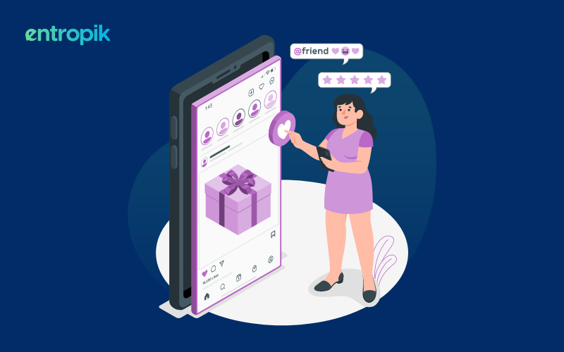
During its early days, Facebook had the “Become a Fan" button for users to connect with pages they liked. However, after some research, they found out that users were more likely to “Like” something instead of becoming a fan. The "Like" button had a cleaner and more universally understood icon - a thumbs-up symbol, which was visually simpler and more intuitive than the previous "Become a Fan" button.
This change had a profound impact, as user engagement with content on Facebook skyrocketed. Users were more inclined to “Like” posts, share content, and engage with pages, leading to increased visibility and reach for online content creators.
In this case, the act of choosing the right button played a crucial role in making Facebook more user-friendly and encouraging frequent interactions.
Such is the power of a great button design.
Read more: The UX Design Process: How to Create Products and Services that Delight Your Users
What is a button?
In simple terms, a button is a clickable or interactive element in an app, website, or software that can perform a specific action or function when clicked or ‘triggered’.
What are the different kinds of buttons and their roles?
Primary button
This button has the most prominent design and color and is used for the primary or most important action on a page. For example, a "Submit" button on a form or a "Buy Now" button in an e-commerce checkout process.
Secondary button
Secondary buttons are used for actions that are less critical than the primary action but still important. They often have a less prominent design than primary buttons and might be used for actions like "Cancel," "Save," or "Apply."
Call-to-Action (CTA) button
CTAs are designed to encourage users to take a specific action, such as signing up for a newsletter, downloading an app, or starting a free trial. They are typically visually distinct and compelling.
Icon button
These buttons consist of only an icon or a small graphical symbol and are used for actions that are universally recognized. For example, a "heart" icon for liking a post on a social media platform or a "settings" icon for accessing account preferences.
Toggle button
Toggle buttons allow users to switch between two states, such as turning a feature on/off or selecting between options like "List View" and "Grid View." They visually indicate the current state, often by changing color or appearance.
Floating Action Button (FAB)
These are circular buttons that typically float above the content and are used for a prominent action in mobile apps. They are often used for actions like creating a new item or composing a message.
Dropdown button
Dropdown buttons open a list of options when clicked, allowing users to select one. They are useful for conserving space in the interface while providing access to multiple choices.
Menu button
Menu buttons open a navigation menu when clicked, revealing additional options or links. They are commonly used for organizing and accessing various sections of a website or app.
Read more: Creating an Effective Landing Page UX
Disabled button
Disabled buttons are grayed out and cannot be clicked. They are used to indicate that an action is unavailable or incomplete, such as a "Submit" button on a form until all required fields are filled.
Action button
Action buttons trigger specific actions, such as "Play," "Pause," "Next," or "Previous," in media players or interactive applications.
More options button
This button typically appears as three vertical dots (ellipsis) and opens a menu or popover with additional actions or settings.
Close button
Close buttons are used to dismiss or close a modal, dialog, or pop-up window. They are often represented as an "X" or "Close" label.
Navigation button
Navigation buttons, such as "Next" and "Previous," are used to guide users through multi-step processes or content, such as wizards or slideshows.
Search button
Search buttons initiate a search query when clicked, often accompanied by a text input field where users enter their search queries.
Button design rules and best practices
When it comes to UX button design, following a few best practices can significantly enhance the user experience and improve conversion rates. Here are some essential UX button design principles:
Keep it clear and simple
A fundamental principle of button design is to keep it clear and simple. Users should immediately understand a button's purpose without confusion or guesswork. To achieve this, buttons should have concise and straightforward labels. Use language that is simple, familiar, and directly communicates the intended action. Avoid jargon, technical terms, or ambiguous phrases that might puzzle users. For instance, instead of using a vague label like "Proceed," opt for a clear and action-oriented label like "Continue" or "Next”.
Read more: UX Content Testing: Unlocking the Potential of Your Content
Use color and contrast
In button design, color and contrast play a pivotal role in drawing users' attention and conveying the intended action. When designing buttons, it's essential to select colors that stand out from the surrounding content while harmonizing with the overall color scheme. The use of color psychology can guide designers in choosing colors that evoke the desired emotions or actions. For instance, a vibrant red "Buy Now" button can stimulate a sense of urgency and encourage users to make a purchase. Contrast between the button color and the background ensures visibility, making it easier for users to spot and interact with the button.
Manage size and proximity
Button size and placement within the user interface significantly impact usability and user experience. Buttons should be large enough to be easily clickable, even on touch devices, without requiring precise taps. However, they shouldn't be so oversized that they dominate the page and create a cluttered appearance. Placing buttons in proximity to the related content or action they represent enhances user understanding. For example, positioning a "Submit" button directly below a form ensures users associate the button with the act of submitting their information. Proper size and proximity contribute to a seamless and intuitive user flow.
Maintain consistency
Consistency in button design across an interface fosters familiarity and predictability for users. Buttons representing primary actions, such as "Sign Up" or "Checkout," should have a uniform style throughout the application or website. Consistency extends to button placement, color schemes, and typography. This predictability reduces cognitive load and enables users to navigate the interface confidently.
Prioritize the hierarchy
Designers should prioritize buttons based on their significance, making primary actions more prominent. Typically, primary actions like "Purchase" or "Submit" are visually distinct from secondary or tertiary actions. This differentiation can be achieved through variations in color, size, or positioning. For instance, the primary action should be highlighted with a bold color, while secondary actions should appear slightly less conspicuous. Prioritizing the hierarchy helps guide users toward the most critical actions, ensuring they are readily accessible and identifiable.
Manage whitespace
Whitespace, also known as negative space, is the area around and between elements in a design. In button design, whitespace plays a crucial role in reducing visual clutter and ensuring buttons are easily distinguishable. Adequate spacing around buttons minimizes the risk of accidental clicks or interactions with neighboring elements. It is important to ensure that there is a balance, so that the buttons are neither too cramped nor too isolated.
Provide visual feedback
Visual feedback is a fundamental aspect of button design that informs users about the status of their interaction. When users hover over a button or click it, they expect to see a response to confirm that their action was successful. Designers can implement visual feedback by changing the button's appearance temporarily. For instance, the button color may shift or become slightly darker when hovered over, indicating interactivity. Clicking the button can trigger a change in color, shape, or an animation to signify that the action is being processed.
Read more: The Impact of User Research on Website Structure
Consider icon usage
Incorporating icons alongside button labels can reinforce their meaning and enhance user comprehension. Icons provide visual cues that complement the text, especially in international contexts where language barriers may exist. For example, a shopping cart icon next to the "Add to Cart" button immediately communicates its purpose, regardless of the user's language. However, it's essential to use universally recognized icons, as the interpretation of icons can vary across cultures.
Ensure responsive design
Buttons should adapt to different screen sizes and orientations, ensuring that they remain usable and visible on both desktop and mobile platforms. Responsive design involves considerations like touch-friendly button sizes, adjustments in layout for smaller screens, and optimizing touch interactions. Testing button behavior on various devices is essential to provide a consistent user experience across all platforms.
Optimize the button placement
Strategically positioning buttons is key to guiding users through the interface effectively. Critical buttons, such as "Submit" or "Next," should be placed where users naturally expect to find them. For example, e-commerce websites commonly position the "Add to Cart" button next to product listings, as users expect it to be near the item they want to purchase. Thoughtful button placement simplifies navigation and reduces user effort, enhancing the overall user experience.
Use progressive disclosure
Progressive disclosure is a user interface design technique that involves revealing additional information or options gradually, rather than overwhelming users with excessive details upfront. Buttons can play a pivotal role in implementing progressive disclosure. For instance, a "Show More" or "Read More" button can expand a collapsed section of content when clicked, preventing information overload while allowing users to access more details when they desire. This approach enhances content organization and ensures that users can explore additional information at their own pace.
Implement effective error-handling
Button design should incorporate effective error-handling mechanisms to help users recover from mistakes. When users encounter errors or validation issues after clicking a button, the error message should be clear, specific, and located near the button to which it pertains. Additionally, buttons should offer clear options for users to correct their errors or navigate back to the previous step. Thoughtful error handling contributes to a smoother user journey, reducing frustration and enhancing the overall user experience.
Conduct user testing
Usability testing, involving real users interacting with the interface, is a valuable step in button design. User testing can uncover issues and improvements that may not be apparent during the design phase. By observing how users interact with buttons, designers can gather qualitative feedback on button design, placement, and overall usability. User testing provides insights into users' preferences, pain points, and potential stumbling blocks, enabling designers to refine the button design for better user engagement and satisfaction.
{{cta-trial}}


.jpg)


