
Tools that streamline and enhance the design process are invaluable, given the growing importance of UX design. Figma has emerged as a leading design tool, favored by UX designers and teams for its collaborative capabilities and powerful features. Whether you're a seasoned designer or just starting, this guide will walk you through the essentials of Figma design creation and prototype testing, ensuring you can leverage this tool to its fullest potential.
Getting Started with Figma
What is Figma?
Figma is a cloud-based design tool that allows users to create user interfaces, vector graphics, and interactive prototypes. Its primary advantage lies in its real-time collaboration feature, which enables multiple users to work on the same project simultaneously, making it ideal for team environments. Unlike other design tools that require local software installations, Figma runs entirely in your browser, ensuring that you always have access to the latest version of your design files from any device.
Setting Up Your Workspace
- 1. Create an Account: Visit Figma's website and sign up for an account. You can choose between free and paid plans, depending on your needs. The free plan offers a robust set of features suitable for individual designers and small teams, while the paid plans provide additional functionalities and more collaboration options.
- Dashboard Overview: Once logged in, you'll see the Figma dashboard. This is where you can manage your projects, access recent files, and create new designs. The dashboard is intuitively organized, making it easy to navigate between different projects and files. You can also join teams, and access shared projects directly from the dashboard.
- Creating a New File: Click on the "+" icon to create a new design file. You can name your project and start designing immediately. Figma allows you to categorize your projects and files, making it simple to keep your work organized. Additionally, you can import existing design files from other tools like Sketch or Adobe XD.
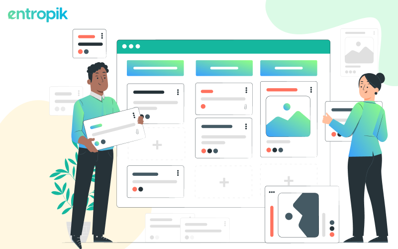
Design Creation in Figma
Understanding the Interface
- Canvas: The main area where you create your designs. The canvas is infinite, allowing you to create as many frames (artboards) as you need. This flexibility makes it easy to manage different screens and states within a single project file.
- Toolbar: Located at the top, it contains tools for selecting, drawing, text, shapes, and more. The toolbar is your primary means of interacting with the canvas, providing quick access to all the tools you need to create and edit your designs.
- Layers Panel: Found on the left, it helps manage different elements in your design. The Layers panel shows a hierarchical view of all elements in your design, making it easy to select and organize layers, groups, and frames.
- Properties Panel: On the right, it displays the properties of the selected element, such as size, position, and color. The Properties panel dynamically updates based on the selected element, providing contextual controls for precise adjustments.
Basic Tools and Features
- Shapes and Pen Tool: Use these to create basic shapes and custom vector paths. The shapes tool includes rectangles, circles, lines, and polygons, while the Pen tool allows you to draw custom vector paths and edit anchor points for more complex shapes.
- Text Tool: Add and style text elements with various fonts, sizes, and weights. The Text tool provides comprehensive typography controls, including font selection, size adjustment, line height, letter spacing, and text alignment.
- Colors and Styles: Apply colors, gradients, and styles to elements. You can save these as reusable styles. Figma's color picker allows you to select colors using HEX, RGB, or HSL values. You can also create and apply gradients, as well as save and reuse color styles across your project.
- Components: Create reusable elements (buttons, icons) that can be used across your project. Changes to a component update all instances. Components are a powerful way to maintain consistency in your design. You can create a component once and use it multiple times. When you update the main component, all instances of that component will automatically update as well.
- Frames and Layout Grids: Organize your design using frames and align elements with layout grids for consistency. Frames act as containers for your design elements, similar to artboards in other design tools. Layout grids help you align and space your elements consistently, ensuring a balanced and visually appealing design.
Creating a Simple Design
- Setting Up a Frame: Start by creating a frame (artboard). You can choose from preset device sizes or create a custom size. Frames provide the boundaries for your design, whether you're creating a mobile app screen, a website layout, or any other type of digital interface.
- Adding Elements: Use the shapes and pen tool to draw basic elements. Add text using the text tool. Begin by adding the foundational elements of your design, such as rectangles for buttons, text boxes for labels, and custom shapes for icons or graphics.
- Styling Elements: Apply colors, gradients, and effects to your elements. Experiment with different fonts and text styles. Use the Properties panel to fine-tune the appearance of your elements. You can add shadows, adjust opacity, and apply borders or radius to create a polished look.
- Creating Components: If you have repeated elements like buttons, convert them into components for easy reuse. Select the element you want to turn into a component, right-click, and choose "Create Component." This action makes it easy to maintain consistency and quickly update repeated elements across your design.
Advanced Figma Features
Auto Layout
Auto Layout is a powerful feature in Figma that allows you to create dynamic and responsive designs. It automatically adjusts the position and size of elements based on their content and the rules you define. This is particularly useful for creating layouts that need to adapt to different screen sizes or content changes.
Creating Auto Layout Frames
- Select Elements and Apply Auto Layout: Begin by selecting the elements you want to include in an Auto Layout frame. Right-click and choose "Add Auto Layout" or use the shortcut (Shift + A). This action will wrap the selected elements in an Auto Layout frame.
- Set Padding, Spacing, and Alignment Options: Once Auto Layout is applied, you can adjust padding (space inside the frame), spacing (space between elements), and alignment (how elements are positioned within the frame). These options are available in the Properties panel, allowing you to fine-tune the layout to meet your design requirements.
Responsive Design
- Use Auto Layout to Create Responsive Designs: Auto Layout enables you to create designs that adapt to different screen sizes. For instance, if you add more text to a button, Auto Layout will automatically resize the button to fit the text. This responsiveness ensures your design remains functional and aesthetically pleasing on various devices.
- Combine with Constraints for Maximum Flexibility: To enhance responsiveness, use Auto Layout in conjunction with constraints. Constraints allow you to define how elements should behave relative to their parent frame (e.g., pinned to the top, bottom, or center). This combination provides a robust solution for designing flexible and adaptable interfaces.
Variants
Variants in Figma enable you to create different states of a component, such as buttons with states like default, hover, and active. This feature is essential for maintaining consistency and efficiency in your design system.
Creating Variants
- Convert a Component into a Variant: Select a component, right-click, and choose "Add Variant" or use the shortcut. This action will allow you to create multiple versions of the component within a single frame.
- Add Different States: Once you have a variant, you can create different states by duplicating the component within the variant frame and modifying each copy to represent a different state (e.g., changing colors, adding shadows, or adjusting text).
Switching Between Variants
- Use the Properties Panel to Switch States: In the Properties panel, you can switch between different states of the variant. This functionality allows you to quickly preview and apply different component states in your design, ensuring a smooth and consistent user experience.
Plugins and Integrations
Figma supports various plugins and integrations that extend its functionality, allowing you to enhance your design workflow and capabilities.
Installing Plugins
- Browse and Install Plugins from the Figma Community: Visit the Figma Community to browse available plugins. Popular plugins include Unsplash for adding high-quality images, Content Reel for inserting placeholder text and images, and Stark for checking accessibility compliance.
- Installation Process: To install a plugin, click on it in the Community, then click "Install." The plugin will be added to your account and accessible from the main menu.
Using Plugins
- Access Installed Plugins from the Main Menu: To use a plugin, go to the main menu, select "Plugins," and choose the installed plugin you want to use. Plugins can perform various tasks, from automating repetitive actions to integrating with other tools and services.
- Enhance Your Design Workflow: Utilize plugins to streamline your workflow, improve efficiency, and ensure your designs meet specific requirements. For example, using the Stark plugin can help you ensure your design is accessible to users with disabilities.
Best Practices for Figma Design
Adopting best practices in Figma can significantly improve your design process, making your work more organized, efficient, and collaborative.
Organizing Your Files
- Naming Conventions: Use clear and consistent naming conventions for frames, layers, and components. Descriptive names make it easier to locate and manage elements within your design file. For example, use names like "Header/Main" or "Button/Primary" instead of generic names like "Frame 1" or "Rectangle 1."
- Layer Management: Group related elements and use the Layers panel to keep your design organized. Create logical groups and layers, which helps you navigate your design and make global changes more efficiently. Utilize the grouping and nesting features to structure your elements hierarchically.
- Component Libraries: Create and maintain a component library for reusable elements. This ensures consistency across your designs and allows for easy updates. A well-maintained component library can save time and reduce errors, as changes to components will automatically propagate throughout your project.
Collaborative Design
- Real-Time Collaboration: Invite team members to your project and collaborate in real-time. Figma's collaborative features allow multiple designers to work on the same file simultaneously, providing instant feedback and reducing the time needed for iterations. Use the commenting feature to discuss design decisions and resolve issues quickly.
- Version History: Figma automatically saves version history, allowing you to revert to previous versions if needed. This feature is crucial for tracking changes and managing different iterations of your design. You can view and restore previous versions from the "File" menu, ensuring you never lose important work.
- Design Systems: Develop a design system to maintain consistency and streamline the design process across projects. A design system includes standardized components, styles, and guidelines that ensure a cohesive user experience. By using a design system, you can reduce redundancy, improve collaboration, and maintain a high level of quality in your designs.
Prototyping in Figma
What is Prototyping?
Prototyping involves creating interactive and clickable versions of your designs. It allows you to simulate the user experience and test the flow of your application or website. Prototyping in Figma helps you visualize how your design will function in the real world, providing valuable insights into usability and user interaction.
Setting Up a Prototype
- Create a Prototype Frame: Select the frames you want to include in your prototype. Prototyping frames are the same as your design frames, but you'll add interaction elements to make them clickable and navigable.
- Add Interactions: Switch to the Prototype tab. Click on elements and drag the blue circle to the destination frame to create interactions. You can define how users will navigate through your prototype by connecting elements to different frames.
- Define Triggers: Choose how the interaction should occur (on click, hover, drag, etc.). Figma offers various trigger options to simulate different user interactions, making your prototype feel more realistic.
- Animate Transitions: Select animation effects like dissolve, slide, or smart animation to enhance the transition between frames. Animated transitions add a layer of polish to your prototype, helping to convey the intended user experience more effectively.
How To Test Your Figma Designs with Real Users?
Looking for a straightforward approach to validate your Figma designs with real users? Qatalyst by Entropik allows you to gather real-time user feedback on your Figma designs.
Qatalyst offers a test block feature that allows users to conduct prototype testing. It is a type of testing that involves evaluating a preliminary version of a product to identify design flaws and gather feedback from users or stakeholders. You can upload a prototype of your website or mobile app, define the flow of the design and test it on respondents and gather responses.
Prerequisite for prototype link
- The file has to be publicly accessible.
- The file has to be from the services we support, "Figma" and "Sketch", for now. (We will be adding more in the future)
- The file should have at least two screens.
- Ensure the prototype nodes are connected, and there is a clear starting node with no independent nodes or all the nodes are connected.
Steps for adding prototypes
- Access your recent Figma projects by visiting https://www.figma.com/files/recent. This page will display a list of your Figma projects.
- Choose the specific project you want to test with Qatalyst.
- To open the prototype, simply click on the play button ▶️ located in the top menu.
- In the top menu, locate and click the "Share Prototype" option. This will generate a shared URL for your prototype.
- Qatalyst is compatible with all types of prototypes, including those designed for desktop, mobile, and tablet devices.
- Ensure the Link Sharing Settings are set to "Anyone with the link can view." It is important for your Figma prototype to be publicly accessible in order to import it successfully.
- Once you have set the sharing settings, click on the "copy link" button. Then, simply paste the copied link into Qatalyst for seamless integration.
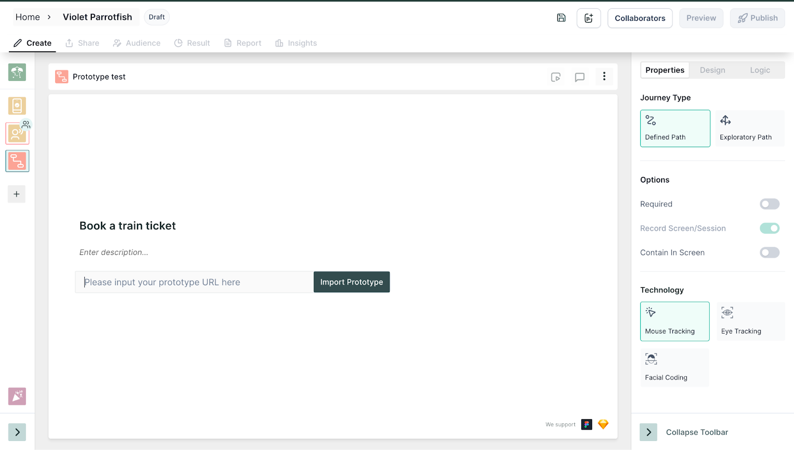
- Add a task that you want the users to complete on your prototype, along with the tracking technologies.
- Share it with your respondents or access Qatalyst’s integrated audience to unlock AI-powered insights on your prototype.
{{cta-trial}}
Frequently Asked Questions
How do I test my Figma design?
Figma designs can be validated and tested on real users on Qatalyst - an integrated user research platform with Insights AI. It gives you AI powered insights on user journeys using mouse tracking, facial coding and eye tracking technologies.
How do I send a Figma prototype for testing?
Copy your figma link and simply paste it on Qatalyst’s platform to test it out on real users.
What is prototype testing?
Prototype testing entails developing a prototype and evaluating it with actual users to validate your design decisions. The primary objectives of prototype testing include identifying any issues or areas for enhancement early on. This allows you to make necessary adjustments before the development phase begins.


.jpg)


