Mobile-first design builds for the smallest screen first and progressively adds features for larger screens, rather than designing for desktop and stripping features down for mobile, an older method called graceful degradation. With mobile now the majority of internet access, and people checking phones for minutes per session, this approach prioritizes essential content from the start.

Tag
Research
Date
Read Time
9 min
Content
Entropik Team
Mobiles are the most convenient form of accessing information on the go. From the moment we wake up to when we go to sleep, most of us check our phones at least 58 times a day! Mobile phones touch every aspect of our lives. Hence, optimizing your site or platform to fit the 6 screen makes sense.
But this is not easy. The reason is that mobile screens are smaller. This puts design at the forefront to capture the user's attention and improve usability. You can only showcase limited product elements to engage the user. In this make-or-break scenario, it is critical to make the right choice.
So how do you create a successful mobile-first design? Let us find out in this article!
What is Mobile-First Design?
The goal of the mobile-first design strategy is to enhance the user experience by embracing the limitations of smaller screens and emphasizing the features that are essential to consumers.

How Mobile-First Design Strategy Came To Be?
Earlier, websites were frequently created under the idea that users would access them only through their desktops.
Developers eventually tried to change these websites by removing some features to improve browsing on mobile or tablet devices.
This method of website scaling down is referred to as the Desktop-First approach or Graceful Degradation. The problem with this approach is that not all elements on the website adapt effectively to a smaller screen size, and this impairs the visual quality of the website.
To solve this problem, developers created Progressive Advancement or Mobile-First Design. With a mobile-first mindset, website designers were urged to start by building for the smallest devices and then add more features for larger screen sizes.

Why is Mobile-First Design Important?
Let us look at some statistics before we answer this question-
Users, on average, spend 3 hours and 15 minutes using their phones daily.
Each screen session lasts over 3 minutes every time a user checks their phone.
80% of Gen-Z users use their phones more than the preferable usage time.
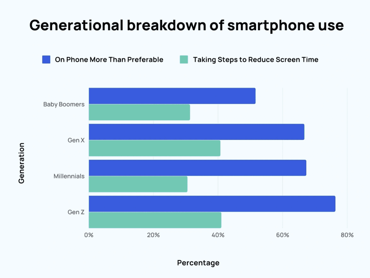
Also, 60% of users access the internet using their mobile devices. This number is a staggering 20% more than desktops.
Now, let's address the question.
Mobile devices have gained and are continuously gaining more popularity. This is because- 1) they are more portable, 2) fit in the palm of our hands, 3) can be used on the go, 4) are more affordable than desktops, and 5) allows direct internet access, unlike desktops or laptops that need Wi-Fi or Ethernet.
With the desktop-first approach, the sore and supplementary components merge. This makes it difficult to distinguish and separate the important elements. It may be an all-inclusive design, but this "cutting down" approach treats mobile design as an afterthought.
By doing this, you risk users dropping off or not using your site or app.
Key Principles for Mobile First Design
Here are some best practices you can remember while creating your mobile-first design-
1) Keep it simple
Another design aspect you can utilize to your advantage is white space. You can keep a tidy, clutter-free layout that is devoid of distractions by using white space. Similar to how the human mind can only hold between 5 and 9 items, make sure your navigation only includes the most crucial information.
2) Visual hierarchy
Mobile first means content-first, prioritize information to provide a clear and succinct experience. In other words, use headings, paragraphs, captions, and other text styles to convey to your audience what information is most crucial.
3) Optimize the content for visual scanning
The text should be optimized for visual scanning since users skim through content instead of reading each detail. To make sense of what is in front of them, people will deliberately search for patterns, such as those that go from left to right or top to bottom. Utilizing that peculiarity, you can arrange your most crucial pieces of information according to a well-established pattern. Use brief paragraphs no longer than two or three sentences and place the most important information above the fold.
4) Avoid using hover effects
Hover effects are useless on mobile because they can't be implemented. Use touch or slide events instead. Additionally, take advantage of the movements that people are already familiar with and optimize your design accordingly.
5) Leave the complexities for the desktop
The desktop version should be used for intricate graphs and images. Optimize the size of your images to prevent them from being cropped out.
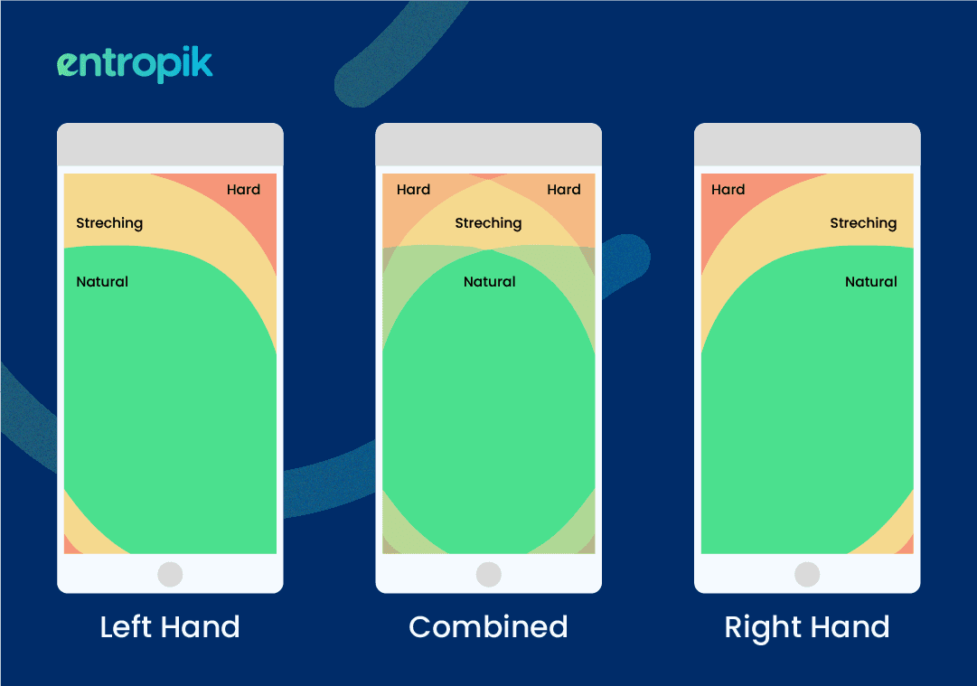
6) Optimize your design to align with the thumb rule
Design wide tap targets no smaller than 30px (Apple recommends at least 44px) to make your design thumb rule friendly. You can make the website more accessible by designing tap items that are simple to locate and click.
How to Implement Mobile-First Approach in Product Design?
1) Create a Content Inventory
Content is king when it comes to mobile-first design. Before you start to design and develop your mobile design, identify the grievances and pain points of your end-users. Your content should be inclusive and comprehensive. It should consider opening times, locations, phone numbers, drop-down menus, directories, etc. It is best to bank, filter, and combine all of your available content on a spreadsheet or document before moving further with your design.
2) Create A Visual Hierarchy
After organizing your content, it's time to create a visual hierarchy. It will serve as a roadmap for your mobile-first web design. The visual hierarchy must consider visual elements, including logos, themes, typography, films, etc. Here are some factors to consider while developing a visual hierarchy- size, color, contrast, typeface, font type and size, white space, size of graphics etc.
3) Designing for Mobile, Tablet, and Desktop: Combining Form and Function
To create a well-rounded website, you need to combine form and function. The mobile design should integrate ease of navigation with a visually appealing design to avoid user drop-offs.
{{cta-case}}
Content should vary and be added as you progress from mobile design to desktop design.
Development Stages of Mobile First Design
1) Make a list of the content
Start your development journey by creating a spreadsheet with all the components you wish to include in your website. This step aims to ensure that no important details are overlooked and that your design is comprehensive and includes all pertinent content. A thorough content list lets you prioritize and allocate resources to the most important design elements.
This step will also help in managing the visual hierarchy of content. You can prioritize the items in the content inventory spreadsheet and decide how to highlight the most significant ones.
2) Work your way up from the smallest breakpoint
Create a wireframe for the smallest breakpoint, such as mobile displays, then scale it up for higher breakpoints, such as tablets and desktops. This method seeks to ensure that your design functions well on small devices before adjusting it for larger screens.
Additionally, it aids in the development of scalable and adaptive designs, ultimately saving you time and effort. In general, scaling up and designing with minor breakpoints work well to create responsive and adaptive designs.
3) Make everything finger-friendly
Links, buttons, and icons that can be clicked on should have a size that a thumb (can easily tap. Users may inadvertently tap on the incorrect element if the clickable components are too small because thumbs are substantially larger than pixel-precise mouse cursors. A clickable element's height and width should be at least 44 pixels.
Make sure that clickable elements are not too near to one another. By significantly raising the size of the buttons and other interactive elements, tapping them is easier. In order to prevent unintentional tapping, you should allow ample distance around any interactive features.
4) Test your design before deploying it
Testing a mobile first design approach on an actual device before release is the most important stage to make sure it is user-friendly and works properly across a variety of devices. You can assess your mobile interface's performance by testing it on a real device. You may check how quickly websites load, how simple the user interface is to use, and whether text and images are readable on a tiny screen. Additionally, you can check to see if the interface works well with touch inputs and if any buttons or links are broken.
You may find it helpful to test on a real device to find bugs that might be concealed on a desktop computer.
Bottom Line
It is important that you choose a progressive advancement approach while developing your site. By having a mobile-first design, you can avoid user drop-offs and enhance the user's experience.
If you don't know when or how to get started, you can check out Qatalyst. It is a AI-powered user research platform that gives you actionable insights about usability, misclicks, bounce rates, drop-offs etc. and helps you optimize your site for mobile devices with pin-pointed accuracy.
Frequently asked questions
1. What is mobile-first design?
Mobile-first design is an approach that starts designing for the smallest, most constrained screen (mobile) first, then progressively enhances the design for larger screens.
2. Why is mobile-first design important today?
With the majority of web traffic coming from mobile devices, designing for mobile constraints first ensures a strong core experience for the largest share of users.
3. What are key principles of successful mobile-first design?
Key principles include prioritizing essential content, using touch-friendly interactive elements, and ensuring fast load times given typically more constrained mobile network conditions.
4. How does mobile-first design differ from responsive design?
Responsive design adapts an existing layout to different screen sizes, while mobile-first design starts the entire design process with mobile constraints as the foundation.
5. How can usability testing improve mobile-first design?
Testing directly on real mobile devices with representative users can reveal specific touch interaction, readability, or navigation issues unique to the mobile-first approach.


