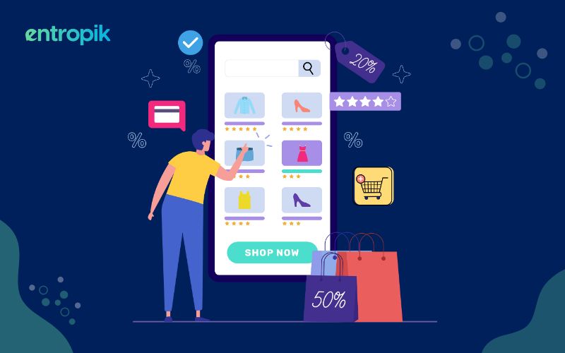
Imagine you're shopping for a new pair of shoes online. You've found a few pairs you like and are ready to check out. But then you get to the sign-up page, and it's a disaster. The form is long and complex, with fields you need help with. The language needs to be clearer, and the buttons need to be bigger. You start to get frustrated, and you're about to abandon your cart.
This is a common scenario that many users struggle with every day. Sign up pages are often overlooked, but they can play a major role in determining whether or not a user decides to convert. A great sign up page design can differentiate between a successful conversion and a lost customer.
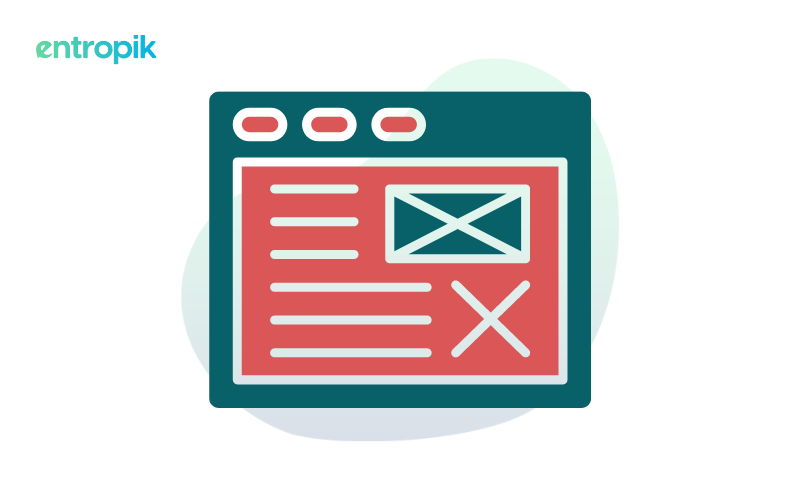
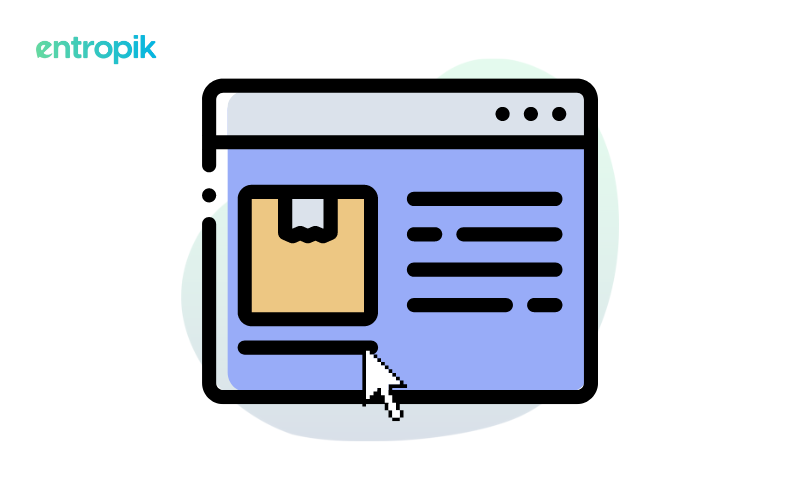
What is a Sign Up Page?
A sign up page, also known as a sign up form, is a web page that allows users to create an account or subscribe to a service, platform, or website. It typically requires users to provide specific information, such as their name, email address, username, password, and sometimes additional details like age, gender, or preferences.
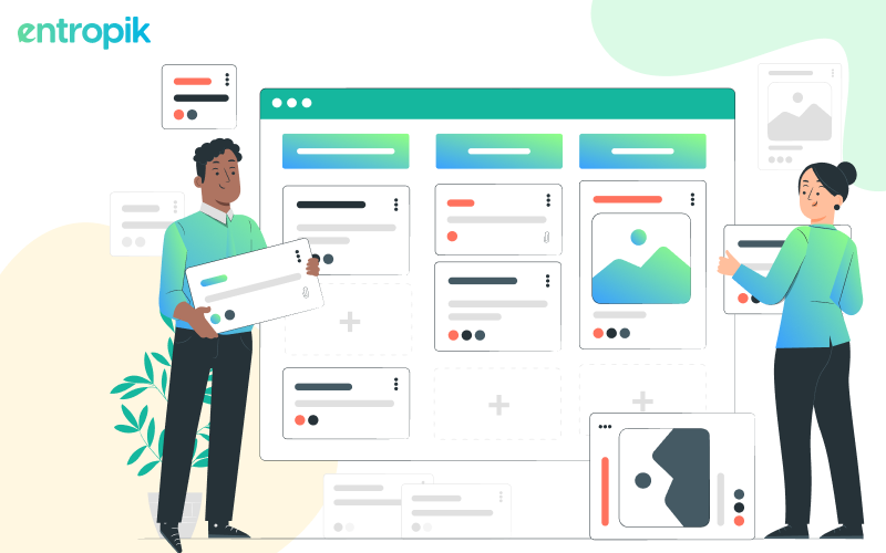
10 Sign Up Page Design Best Practices
1. Clear and concise headline
A clear and concise sign up page can instantly communicate its purpose to users. It serves as a user-friendly guide, ensuring visitors understand why they are being asked to sign up and what benefits they will gain. A clear and concise headline can minimize confusion and foster a positive first impression, increasing the likelihood that visitors will proceed with the sign up process.
To achieve an effective headline,
- Identify the primary value proposition or benefit users will receive by signing up. Craft the headline around this central message to make it immediately compelling.
- Use simple language and avoid jargon or overly technical terms.
- Provide enough detail in the headline to answer the "what" and "why" questions. For example, "Join our newsletter for weekly tips" is more effective than saying "Sign Up."
- Keep the headline brief, ideally within a sentence or phrase.
- Use the right typography and layout to make the headline visually prominent. It should be one of the first elements users notice when they land on the page.
2. Minimalist design
By simplifying the visual elements and reducing clutter, a minimalist design focuses users' attention on the essential components of the page – the sign up form and the call to action (CTA) button. This improves clarity, reduces distractions, and makes it easier for users to complete the sign up process.
To achieve a minimalist design:
- Simplify the layout by removing unnecessary elements, such as excessive images, text, or decorative graphics.
- Use white space to create room between elements to improve readability effectively.
- Stick to a limited color palette that aligns with your brand's identity.
- Choose clean and legible typefaces for text and headings. Maintain consistency in font styles and sizes throughout the page.
- Focus on key elements (such as the CTA button) through color contrast, size, or whitespace to draw attention to them.
- Keep the text concise and to the point.
- Ensure the minimalist design remains visually appealing and functional on desktop and mobile devices.
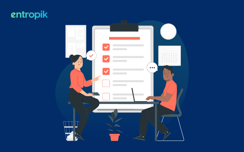
3. User-friendly form
Having a user-friendly form is critical to the success of a sign up page design as it directly impacts how easily users can complete the registration process. Creating a user-friendly form ensures that users are not frustrated and leads to higher conversion rates and a positive user experience.
To create a user-friendly form:
- Include only essential fields in the form, such as name, email, and password. Minimizing the number of required fields reduces user effort and time.
- Provide clear and concise labels for each field, including brief instructions or examples to guide users.
- Organize the form fields logically. Start with basic information like name and email before moving on to more detailed information.
- If a password is required, include a password strength meter to help users create secure passwords.
- Enable autofill and autocomplete features when applicable.
- Ensure that the form is mobile-responsive and optimized for touchscreens. Use larger input fields and buttons to accommodate mobile users.
- If the sign up process involves multiple steps, use progress indicators to show users where they are in the process and how many steps remain.
- After submission, display a clear confirmation message and, if applicable, a confirmation email notice.
4. Progress indicators
A progress indicator is a valuable addition to a sign up page design because it helps users understand where they are within the process, how much more information they need to provide, and what to expect next. This visual cue reduces uncertainty and anxiety, making users more likely to complete the sign up process.
To create an effective progress indicator,
- Divide the sign up process into clear and manageable steps. Each step should represent a distinct stage of the registration process.
- Use a visual element, such as a horizontal bar or a numbered list, to represent the steps and highlight the current step.
- If applicable, indicate which steps are optional so users understand that they have a choice.
- Allow users to navigate back and forth between steps in the process.
5. Strong Call to Action (CTA)
A strong Call to Action (CTA) is a pivotal element of a sign up page design as it directly influences user behavior and conversion rates. A well-crafted CTA serves as a clear and compelling invitation for users to take the desired action which, in this case, is signing up.
To create an effective CTA:
- Use action-oriented language such as "Sign Up Now," "Get Started," or "Join Us Today" to prompt users to proceed with the registration process.
- Make sure it stands out prominently on the page with a contrasting color and a size that makes it easily noticeable.
- The text on the CTA button should be concise and clearly convey the benefit or outcome of clicking it. For example, if users sign up, what will they gain or experience?
- Ensure the CTA is accessible to all users, including those with disabilities.
- Consider adding a sense of urgency or offering incentives to strengthen a CTA. For instance, indicating that users get limited-time, exclusive benefits can motivate them to take action sooner.
6. Mobile responsiveness
With the increasing usage of mobile devices for browsing and online activities, it's essential that your sign up page functions flawlessly on smaller screens. This ensures that users on smartphones and tablets have a seamless and user-friendly experience.
To achieve good mobile responsiveness:
- Use responsive web design frameworks that automatically adjust page elements for various screen sizes.
- Test the sign up page design on various mobile devices to ensure compatibility and usability.
- Prioritize the most important content and form fields for mobile users to keep the design clean and uncluttered.
- Optimize images and media for faster loading on mobile connections.
- Implement touch-friendly design elements, including appropriately sized buttons and form fields.
- Ensure that text and font sizes are legible on smaller screens without the need for zooming.
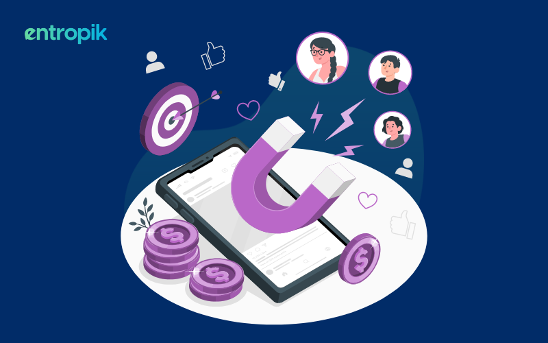
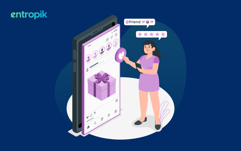
7. Social media sign up options
Incorporating social media sign up options into your sign up page can enhance the user experience and improve conversion rates. It simplifies the registration process and provides users with convenient alternatives to traditional email-based sign ups. Here's how social media sign up options help and how to achieve them:
To provide effective social media sign up options:
- Implement authentication protocols to connect your sign up page with social media platforms securely.
- Display recognizable social media icons or buttons prominently on the sign up page.
- Clearly communicate the benefits of using social media sign up options, such as faster registration and access to personalized features.
- Request the minimum necessary permissions from users' social media profiles to respect their privacy.
- Ensure that users can disconnect their social media accounts from their platform accounts later if desired.
8. Thank-you page
Having a thank-you page as part of your sign up page design contributes to a positive user experience and helps build engagement. A thank you page serves as a confirmation and follow-up step after users have completed the sign up process and can act as a guide on what to do next for users.
To create an effective thank you page:
- Design a dedicated page with a clear and appreciative message, such as "Thank you for joining!" or "Welcome aboard!"
- Include elements encouraging users to take the next steps, such as buttons or links to their profile settings, a tutorial, or a product tour.
- Express gratitude for their registration and emphasize the value they will gain from using your platform.
- Optionally, use this page to reinforce your brand identity and voice, to create an impression.
9. Password Reset Option
Offer multiple secure and convenient password reset options, such as email or security questions. This ensures users can recover their accounts even if they forget their password, preventing unnecessary barriers to accessing your platform.
Here's how to create an effective password reset option:
- Offer a set of pre-defined questions users answer during account creation. These should be personal and not easily guessable, like "What was your childhood nickname?"
- Allow users to link an authenticator app to their account for a more secure password reset option.
10. Multi-language support
If your target audience extends beyond a single language, consider offering multi-language support for your sign-up page. This demonstrates inclusivity and caters to a broader user base, potentially increasing global reach and user engagement.
Here are the steps on how to create a multi-language support option for your sign-up page:
- Identify the languages relevant to your target audience. Consider factors like geographical reach, user demographics, and potential market expansion.
- Integrate a language switcher element into your sign-up page. Users can easily select their preferred language from a dropdown menu, flag icons, or other intuitive options.
- Consider using translation APIs or plugins, especially for dynamic content or frequently changing elements.
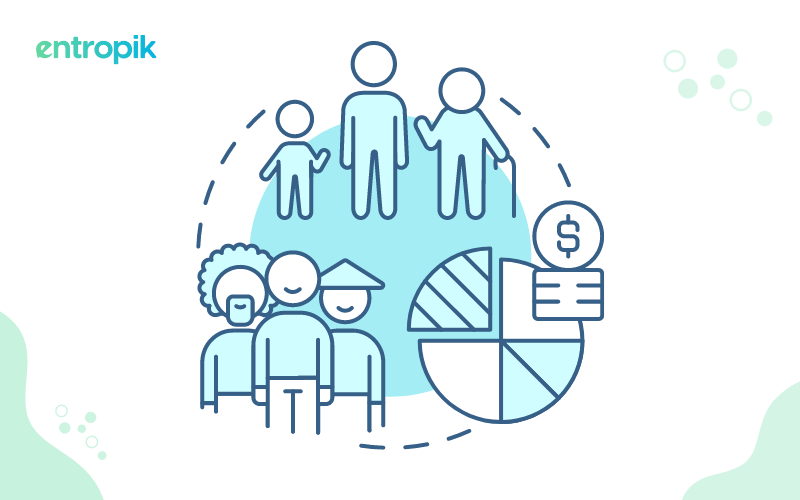
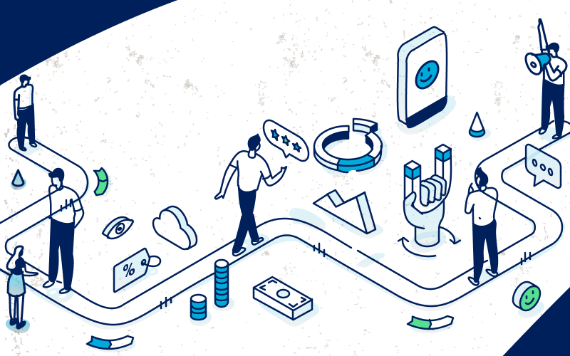
How Can User Research Help Improve the Sign Up Page Design?
User research is a valuable tool for improving sign up page design because it provides insights into user behaviors, preferences, and pain points. Here's how user research can contribute to login page design enhancements:
1. User understanding
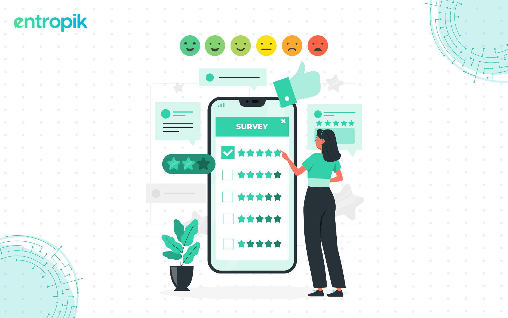
User research, such as surveys, interviews (remote or physical), and usability testing, helps you deeply understand your target audience. You can identify their needs, motivations, and barriers related to the sign up process. This knowledge informs design decisions that can ultimately resonate with users.
2. Feedback Integration
User feedback, collected through surveys, feedback forms, or customer support interactions, provides valuable input for design improvements. Users often highlight pain points, feature requests, or areas of confusion that can be addressed through design changes.
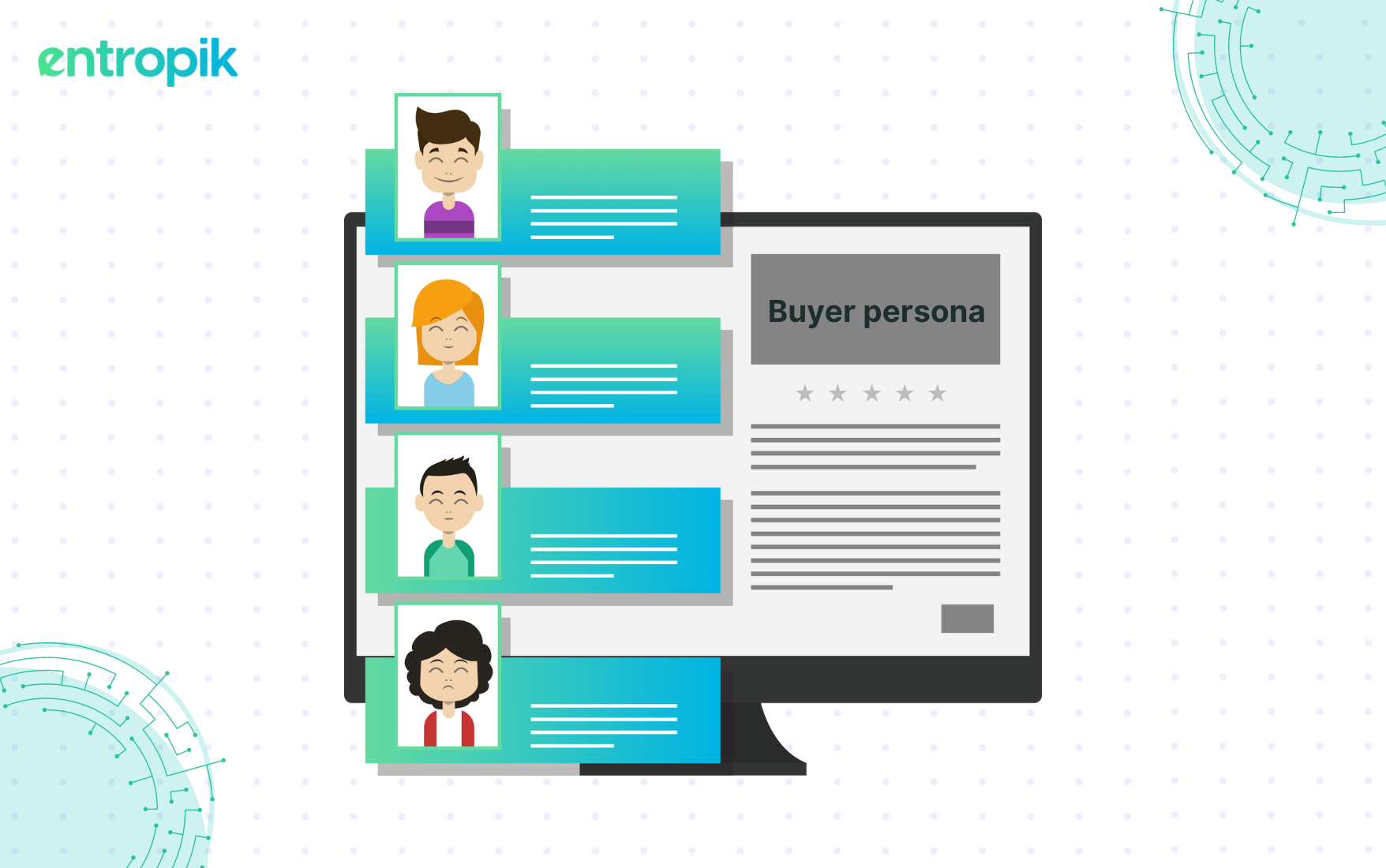
3. Persona development
Creating user personas based on research findings helps you visualize and empathize with your target audience. Personas represent different user segments, allowing you to tailor the sign up page experience to meet the specific needs of each group.
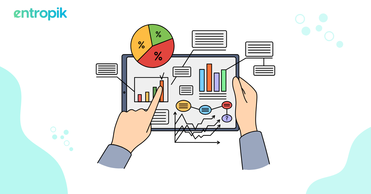
4. Data-driven decisions
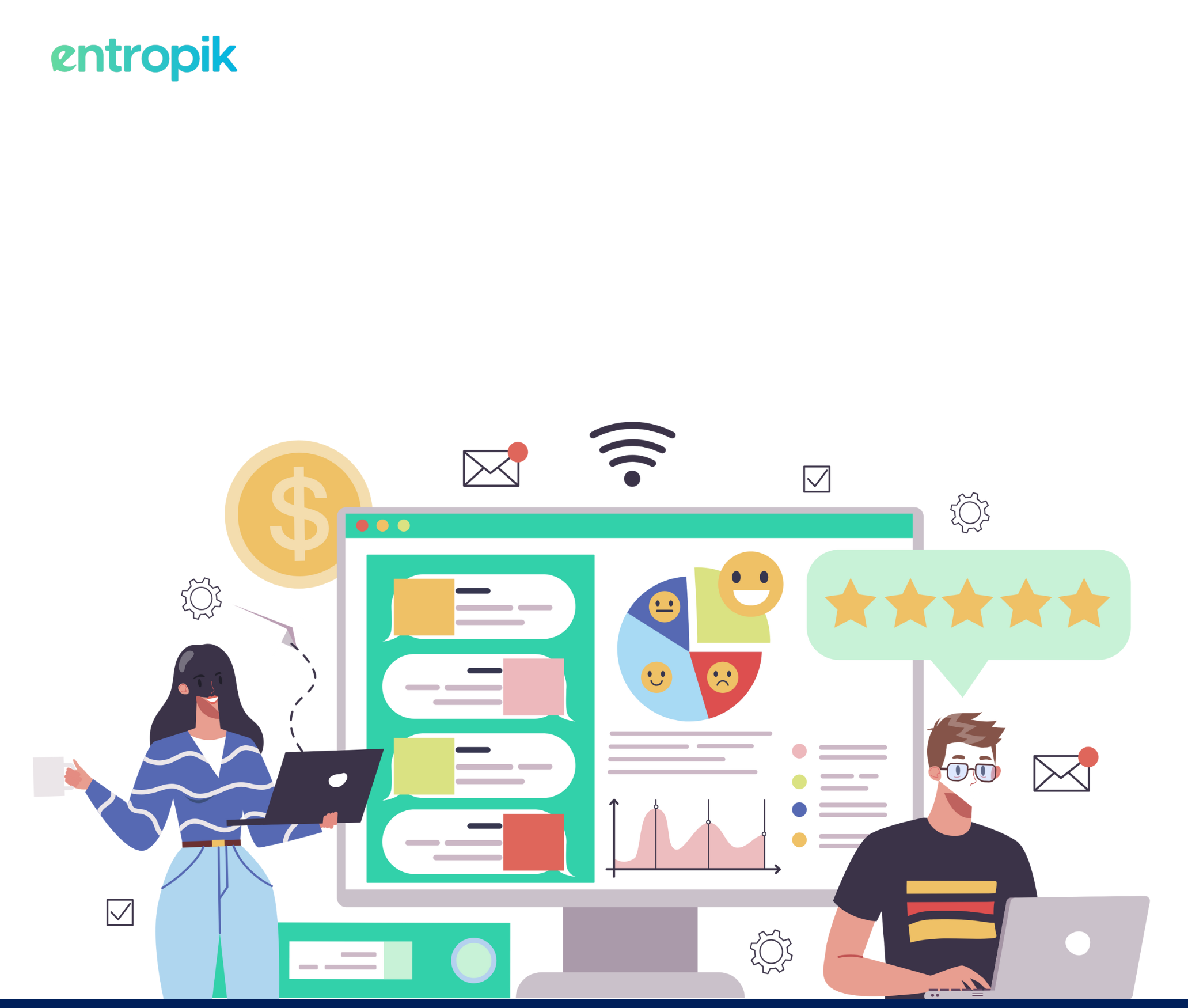
User research complements quantitative data analysis by providing qualitative insights. Combining user research with analytics data (e.g., conversion rates, bounce rates) enables data-driven design decisions that aim to improve sign up page performance.
5. Continuous improvement
User research is an iterative process. By regularly conducting research, gathering feedback, and making incremental design improvements, you can ensure that your sign up page remains user-centric and aligned with evolving user needs.
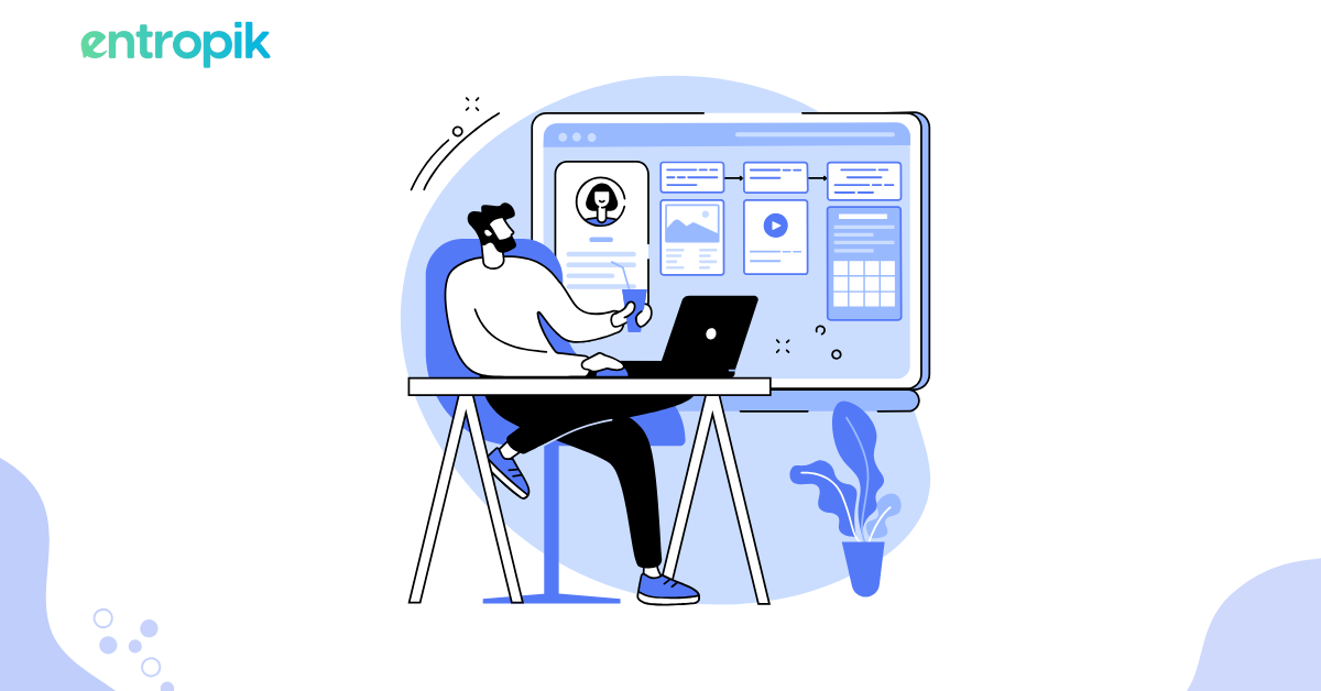
How Do You Use Qatalyst For Your Sign-up Page Design?
Qatalyst is our fully integrated platform to conduct end-to-end user research. With Qatalyst, you can use moderated and unmoderated testing to test your sign up page design through:
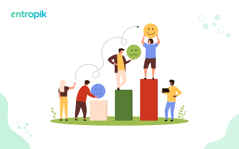
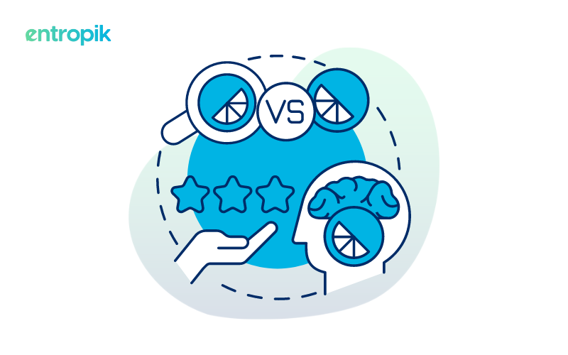
1. A/B testing

A/B testing helps identify which design elements, such as CTA button color, text, or form field arrangements, resonate best with users. It provides quantitative data to inform design decisions. By systematically presenting users with different versions of these elements, A/B testing gauges and compares user responses, providing invaluable insights into which variations resonate most effectively with the target audience.
In Qatalyst, you can conduct A/B testing on images to determine which one users prefer. Additionally, we offer you the ability to integrate various technologies, such as mouse tracking, facial coding, and eye tracking, to gather additional data and insights about user behavior and preferences.
2. Preference testing

Qatalyst offers a test block feature that allows users to test preferences on various product elements. Preference allows you to understand user preferences regarding layout, typography, color schemes, and overall design aesthetics. This information can guide the visual aspects of your registration page design.
To conduct preference testing in Qatalyst, you first need to identify the design elements that you want to test. These could include anything from different color schemes to layout, content, or navigation variations. Once you have identified the design elements, you can create multiple variations of each element and present them to users in randomized order.
3. 5 Second testing

This method helps assess the clarity and effectiveness of your sign up page's messaging and visual hierarchy. It ensures that crucial information is immediately visible to users.
This testing approach becomes particularly crucial in guaranteeing that vital information is present on the sign-up page and quickly and intuitively discernible to users. By offering a snapshot evaluation, the 5-second test helps identify any potential shortcomings in conveying essential details within the initial moments of user interaction.
4. Moderated testing

Moderated testing allows for in-depth exploration of user behaviors and thought processes during the sign up process. Moderated testing helps uncover usability issues, user frustrations, and areas for improvement.
In Qatalyst, you can conduct moderated testing by scheduling a meeting online using a session block. Moderated research hinges on the concept of guiding participants through tasks and prompting them to articulate their thoughts aloud as they navigate a product or service.
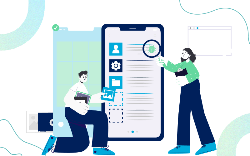
5. Prototype testing

Prototype testing helps identify usability issues, interaction problems, and navigation challenges. Users can provide feedback on the functionality and flow of the sign up process.
Qatalyst offers a test block feature that allows users to conduct prototype testing. You can upload a prototype of your website or mobile app, define the design flow, test it on respondents, and gather responses.
6. Live Website Testing

In UX research, live website testing refers to conducting usability testing or user testing on a live and functioning website. This type of testing is done to gather insights and feedback from users as they interact with the website in its actual environment.
Live website testing unveils user behavior and frustrations with your sign-up page, helping you pinpoint and fix issues that block sign-ups. Qatalyst has a live website testing block that enables researchers to create and present a specific task to participants on a live website.
Final Words
A sign-up page is a crucial first impression for any platform, setting the tone for the entire user experience (UX). Optimized sign-up pages contribute directly to conversion rates and user acquisition. By minimizing barriers and creating a positive first experience, you encourage more users to sign up and successfully become active users of your platform. This translates to increased user engagement and potential growth for your business.


.jpg)