Data visualization is the practice of representing data and information through graphics like charts, graphs, maps, and infographics to make complex information easier to understand. In reports, it helps stakeholders comprehend large volumes of data faster, uncover outliers and trends, and communicate key insights to non-data experts more effectively than raw numbers alone.

We generate approximately 328.77 million terabytes of data daily. But in this data-driven world, data analysis is still an exhausting task. By using data visualization, this problem can be solved.
Data visualization represents data through graphics, such as infographics, charts, and animations. These visual representations simplify complex data relationships and data-driven insights. According to Harvard Business Review, data visualization serves 3 main purposes-1) Visual Discovery, 2) Idea Creation and Illustration and 3) everyday data analysis.
You are mistaken if you think data visualization is only for data teams. Data scientists, analysts, and management all use data visualization to identify, predict and present patterns and trends, insights and to communicate organizational structure and hierarchy.
In this article, we will talk about how you can leverage data visualization to create engaging reports and analyze data easily. So, let's get started!
What is Data Visualization?
Representing data and information visually using graphics like charts, animations, maps, tables, infographics etc., to make comprehension of data easier is known as data visualization.
Data Visualization Examples
There are a variety of ways you can visually represent your data. Here are a few popular data visualization types you can use in your reports and presentations-
General Types of Data Visualizations
1) Charts
A chart is a visual display of data that takes the shape of a graph, diagram, map, or table.
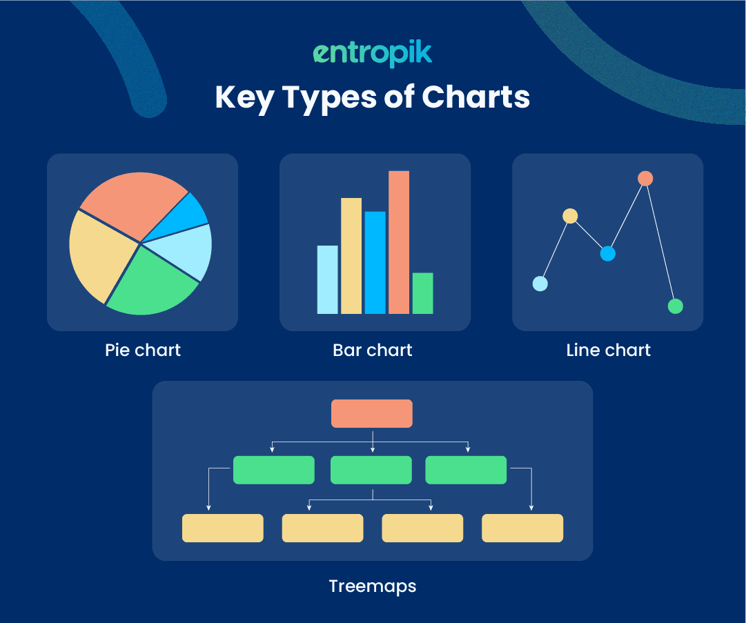
Other popular charts are histogram and box and whisker charts.
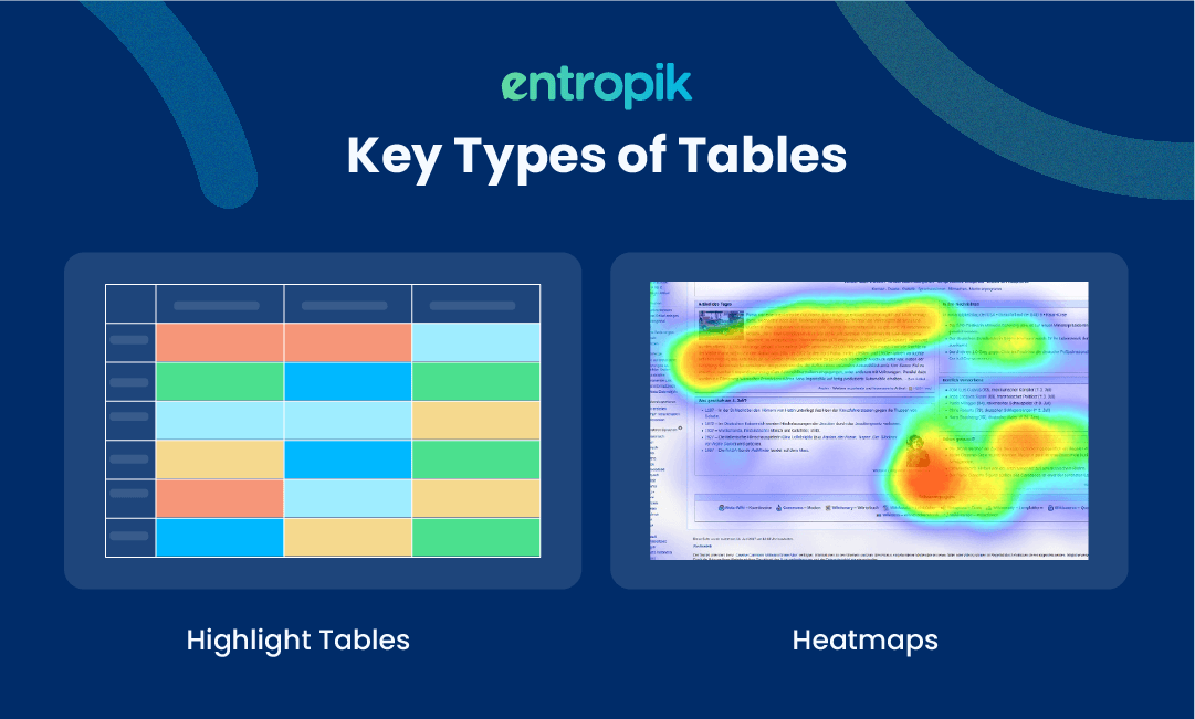
2) Tables
Data is arranged axis-wise in a table. The x-axis is represented by rows, and the y-axis by columns.
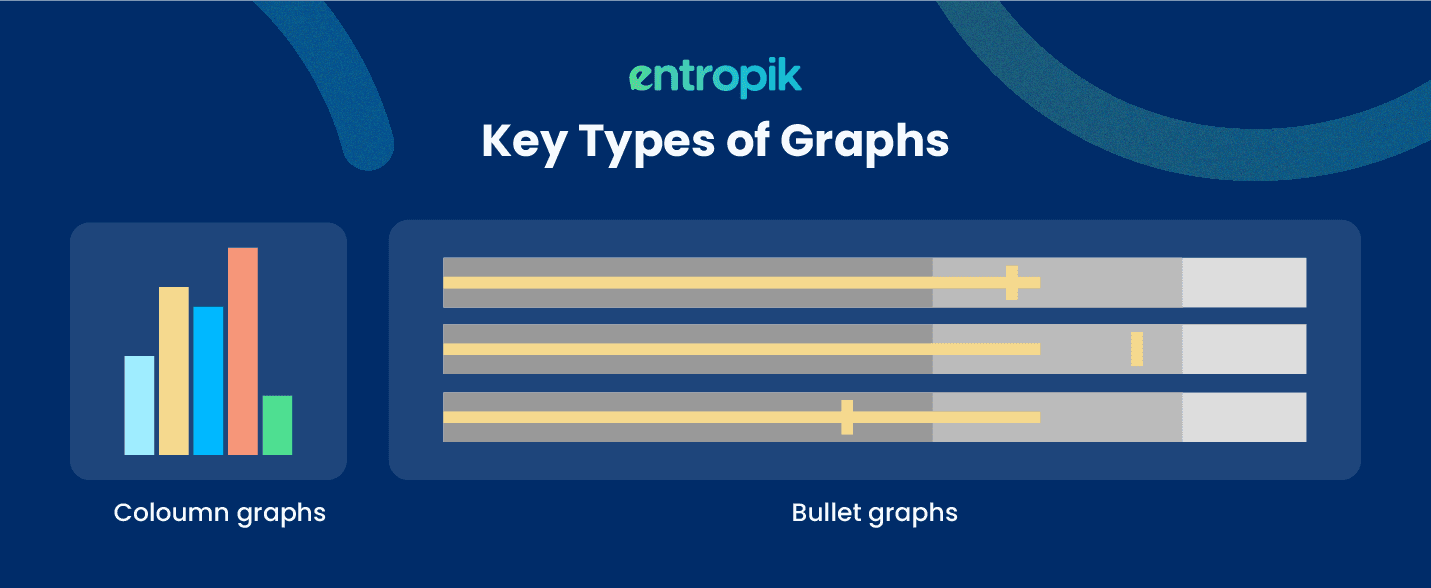
3) Graphs
Graphs are a representation of particular variables in relation to one another using points, segments, lines, or curves, typically along two axes at a right angle.
4) Geospatial
It represents data in the form of a map that uses various shapes and colors to highlight the connections between various data points and certain places.

5) Infographics
They represent data that combine words and images. Infographics usually employ charts or diagrams frequently.
6) Dashboards
Dashboards are a set of data and visualizations gathered in one location for the purpose of analysis and data presentation.
More Specific Examples of Data Visualization
1) Area Maps
Area maps are a type of geospatial visualization that are used to display particular values over a map of a nation, state, county, or any other geographic location. Choropleths and isopleths are two popular types of area maps.
2) Bar Charts
They show numerical values in comparison to one another. Each variable's value is represented by the length of the bar.
3) Heat Maps
They are a map-based geospatial visualization where certain data values are shown as distinct colors.
Why is Data Visualization Important?
The simple answer to this question is that images are processed 60,000 times faster than text. Data visualization helps convert large amounts of data into consumable formats. You can convey complex information and insights comfortably using the various types of data visualizations available.
The other reasons why data visualization is important are-
You can identify trends, patterns and problem areas easily.
You can pin-point the factors that are influencing consumer behavior.
You can comprehend where to place certain items to get maximum engagement.
You can analyze purchase intent and predict the performance of new and existing products.
By using data visualization, you can democratize research and make data-driven decisions faster, without spending hours on complex reports.
Why Use Data Visualization?
Data visualization should be used to-
Easily present and analyze complex data and insights.
Uncover outliers, unknown facts and trends.
Visually gauge patterns and relationships.
Reduce the turn-around-time of the project.
Improve actionability through pin-pointed insights.
Be able to ask better questions and make data-backed decisions.
Conduct comparative analysis.
Improve the quality of the insights.
{{cta-web}}
Advantages of Data Visualization
Data visualization offers a wide range of advantages, some of which are-
Data visualization allows you to comprehend complex and large volumes of data faster and more efficiently.
You can use data visualization to present your research findings to non-data experts.
Data visualization makes information easily accessible and understandable.
It helps you highlight relevant and critical information to all stakeholders.
Get in-depth insights by analyzing trends and patterns.
Improve existing research processes by predicting the performance of your products and creatives.
Disadvantages of Data Visualization
To make a balanced decision, you should know about the disadvantages of data visualization. Here are some pointers you may consider before diving head-first into the dataviz game-
Can lead to misleading assumptions.
Bias may trickle in while making deductions about the data.
Causation is not always the outcome of correlation.
Critical information and messages can get lost or ignored in translation.
Data Visualization and Big Data
The amount of data generated every day is increasing.This has led to an increase in projects involving big data and data analysis. Data visualization plays a key role in converting these large amounts of data into consumable formats.
Machine learning is being used by brands more and more to collect vast volumes of data that can be slow and difficult to go through, understand, and explain. This process may be sped up, and information can be presented to stakeholders and business owners in ways they can understand, using data visualization.
To analyze big data, intricate data visualization techniques like heatmaps are used.
To gather raw data, interpret it, and create graphical representations, big data visualization requires strong computer systems.
While big data visualization has its advantages, there are also some drawbacks you need to consider-
1) A visualization specialist needs to be hired if big data visualization techniques are to be used to their full potential. To ensure that brands are making the best use of their data, this professional must be able to recognise the best data sets and visualization techniques.
2) Since large data visualization demands strong computer technology, effective storage systems, and even a shift to the cloud, it frequently necessitates management and IT engagement.
3) Big data visualization can only yield insights that are as accurate as the data being displayed. This makes quality control of insights a critical component of big data analysis.
To overcome these problems, you can use a research platform like Decode. It enables you to conduct, store and analyze all your data in one place. It is completely DIY, so you don't need to hire professionals for data analysis. It has a simple, user-friendly and intuitive platform that anyone can use. It is also equipped with Emotion AI technologies so that you can get quality insights without worrying about redundant, generic and biased data.
Data Visualization Best Practices
Data visualizations are simple to create and present, but if you want to create engaging reports and woo your stakeholders, here are few best practices you need to implement-
1) Define a Clear Goal or Objective
This may seem obvious, but it is difficult to stay on track when you are drowned in volumes of data. A clear goal can be reached in many ways; you may change how you reach it, but having a clear objective will always keep you on track.
To help set a clear goal, try to answer questions like-
What are the critical insights you want to highlight?
What is the correct understanding you expect your audience to have after your presentation?
2) Know Your Audience
Knowing your audience gives you an edge and lets you stay in control of what is happening. Moreover, it helps you understand whether they know the data and insights you're presenting.
The ultimate goal of data visualization is to communicate complex data with non-data experts easily. To choose the right audience, ask yourself questions like-
What type of context can you offer your audience to help them better understand your visualizations?
Which visualization techniques are most likely available to this particular people?
Always keep your audience in mind while creating your presentations and reports.
3) Don't Complicate Your Report
Adding complex charts to showcase your data, is not going to yield you better results. They might look fancy, but they might end up causing confusion among the stakeholders. Keep your reports simple and clean.
Here are some pointers to help you keep your presentations simple-
Trim unnecessary information and be to the point.
Highlight and present only critical information and insights.
Keep the visualizations short and crisp.
You aim should be to make the data visualizations so easy to consume that stakeholders do not need to use too much of their brainpower to decode them.
4) Maintain the Integrity of the Data
It is easy to trick stakeholders and inflate the data visually. Don't skew your data; try to represent your data as accurately as possible. By altering and distorting the data, you will deceive your audience and reduce the scalability and reliability of your insights.
5) Be sure to include everyone in your visualizations
Do not forget to check that your visualizations are inclusive and accessible. Consider how your visualization's readability is impacted by the usage of white space, contrast, colour, and font sizes. Is it simple for your users, regardless of whether they have 20/20 vision or a visual impairment, to discern between the data and see what's happening? Don't skip this stage because inclusivity and accessibility are essential to effective data visualization.
6) Use a Research Platform
You need a research platform if you are using multiple tools, exporting data from one platform to another or manually creating your reports.
Research platforms like Decode offer a variety of features to help you seamlessly create and present reports-
Online Repository to store all research studies
Auto-transcription and translation
Ability to conduct Quantitative and Qualitative research
Enabled with Emotion AI technologies and ChatGPT-3 integrations
AI-generated highlights, tags, action items and summaries
Auto-generated reports with a variety of data visualization formats
Bottom Line
Data visualization makes complex data and information into easily consumable and visually pleasing formats. Given our brains prefer images over text, it plays an important role in effectively communicating key insights to stakeholders. There are multiple data visualization formats available but it is essential to choose a simple approach when it comes to presenting and creating engaging reports.
Frequently asked questions
1. Why is data visualization important in research reporting?
It makes complex data easier to understand at a glance, helping stakeholders quickly grasp key findings and make faster, more informed decisions.
2. What are best practices for creating engaging data visualizations?
Use the right chart type for the data, keep visuals simple and uncluttered, highlight key takeaways visually, and maintain consistent color and labeling conventions.
3. What common mistakes should be avoided in data visualization?
Avoid overcrowding charts with too much data, using misleading scales, and choosing chart types that don't clearly represent the underlying data relationships.
4. What chart type is best for showing trends over time?
Line charts are generally best for showing trends over time, since they clearly show direction and rate of change across a continuous timeline.
5. How can you make a data visualization accessible to color-blind viewers?
Use colorblind-friendly palettes, add patterns or labels in addition to color, and ensure sufficient contrast between data series.


